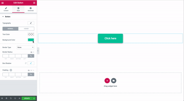
The Button Widget helps you easily design and customize buttons without the need for any other plugins or shortcodes.
Content
- Type: Select from 5 styles of buttons to begin your design. Choose from Default, Info, Success, Warning, or Danger
- Text: Enter the button’s text
- Link: Set the URL for the button’s link. Click the cog to set the link to either open in a new window or to add rel=nofollow to the link
- Alignment: Align the button to the left, center, right, or justified in relation to its column.
- Size: Select the preset button sizes, from Extra Small to Extra Large (see padding default details at the bottom of this document)
- Icon: Select a FontAwesome icon to display on the button
- Icon Position: Set the icon to appear before or after the button text
- Icon Spacing: Adjust the amount of space between the icon and the button text
- Button ID: (Optional) Assign a unique button ID to use for situations such as Google Analytics events
Style
- Typography: Change the default typography options for the button’s text
- Text Shadow: Add a shadow and blur to the button’s text
- Text Color: Select the color of the button’s text
- Background Color: Select the button’s background color for both Normal and Hover states
- Hover Animation: Click on the Hover tab to set a Hover Animation
- Border Type: Select the type of border to use around the button
- Width: Control the thickness of the border around the button
- Color: Choose the border’s color
- Border Radius: Set the border radius to control corner roundness
- Box Shadow: Set options to apply a box shadow on the button
- Padding: Change the padding settings of the button
How to Track “Button onClick” Event (for Facebook Pixel, Google Analytics or Google Tag Manager)
Follow these steps to track button onClick events:
- Edit Button > Advanced > set CSS ID = My_Button
- Add to the page HTML widget (after the button will be fine)
- Paste the following code into the HTML Code field:
- Update page, preview, test
Advanced
Set the Advanced options that are applicable to this widget
How to Make a Download PDF Button
- Add a Text Editor widget
- Upload your PDF through the Text Editor Widget
- Publish the page
- Go to the live page and copy the URL link pointing to the PDF
- Now, in another page, add a Button widget and set the link to the URL
Button Preset Sizes: Padding Defaults
Top, Left, Bottom, Right
- Extra Small: 10px, 20px, 10px, 20px
- Small: 12px, 24px, 12px, 24px
- Medium: 15px, 30px, 15px, 30px
- Large: 20px, 40px, 20px, 40px
- Extra Large: 25px, 50px, 25px, 50px
The Menu Anchor widget allows you to create a page with an internal smooth scrolling navigation.
Content
Anchor
- Drag the Menu Anchor widget to the top of the area you want the link to scroll to
Note: The widget takes up no actual space and is invisible to the visitor.
- Give the anchor a name. (ie: contact-us)
- Edit the menu or widget element that will be linking to your anchor
- Type ‘#’ + the anchor name (ie: #contact-us) in the URL link field of the menu item or widget element. Please note The ID link ONLY accepts these chars: `A-Z, a-z, 0-9, _ , -`

Advanced
Set the Advanced options that are applicable to this widget
Menu Anchors are only supported when used on the same page. Link anchors on different pages may not work properly and are not supported.
Adjust Sticky Header Offset for Anchor Links
If you are using a Sticky Header and anchor links, the sticky header may overlap the top portion of the anchor linked content. If that happens, add the following code to your CSS (Appearance > Editor > Additional CSS). Be sure to change the “80px” below to match the height of your fixed header.
body:not(.elementor-editor-active) .elementor-menu-anchor:before {
  content: "";
  display:block;
  height: 80px; /* fixed header height*/
  margin: -80px 0 0; /* negative fixed header height */
  visibility: hidden;
  pointer-events: none;
}
The Heading Widget allows you to create stylish title headings.
Content
- Title – Type your heading text.
- Link – Link the heading to a URL
- Size – Change the heading to Small, Medium, Large, XL or XXL
- HTML Tag – Set the heading’s HTML tag to H1- H6, Div, Span or Paragraph
- Alignment – Align the heading to the left, right, center, or justified
Style
- Text Color – Choose the color of the heading text
- Typography – Change the typography options for the heading text
- Text Shadow – Add a shadow and blur to the heading text
- Blend Mode – Select from multiple layer effects including Normal, Multiply, Screen, Overlay, etc.
Advanced
Set the Advanced options that are applicable to this widget
The Text Editor widget is a TinyMCE WYSIWYG editor that behaves just like the classic WordPress visual editor. You can enter rich text, images and even WordPress shortcodes.
In addition to the features that normally appear on the TinyMCE editor, this widget also gives you more styling options that let you change settings like font weight, line height, letter spacing, alignment and more.
Content
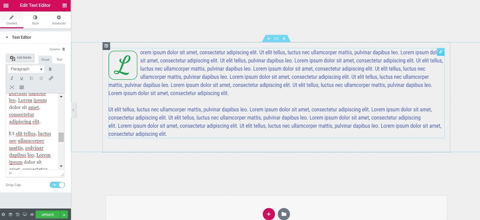
Drop Cap: Slide to ON to set the first letter of the text as a Drop Cap, which makes it larger and gives it the ability to be styled independently from the rest of the text.
Style
Text Editor
- Alignment: Align the text to the left, right, center, or justified
- Text Color: Choose the color of the text
- Typography: Set the typography options for the text
- Columns: Select the number of columns to split the text into
- Column Gap: Set the width of the gap between columns
Drop Cap
- View: Select the view style of the drop cap, choosing from Default, Stacked, or Framed
- Primary Color: Choose the color of the drop cap
- Space: Select the exact space between the drop cap and the rest of the text
- Border Radius: If Stacked or Framed is chosen as the View, set the border radius to control corner roundness
- Typography: Set the typography options for the drop cap
Advanced
Set the Advanced options that are applicable to this widget
Example of Splitting Text Into Multiple Columns
How to Wrap Text Around Images With the Text Editor Widget
Users sometimes ask how to wrap text around images in Elementor. This is an excellent use of the Text Editor widget. Simply drag-in the widget, click Add Media and upload an image of your choosing to the media library of WordPress. Then click the image, and adjust the alignment settings to wrap the text around the image, with the image to the right or left of the text.

Is The Text Editor Widget Missing The Visual and Text tabs?

The Text Editor widget respects the user’s choice in WordPress settings to enable or disable the Visual Tab. If your tabs are missing, please go to the WordPress Dashboard > Users > Your Profile and uncheck the option to disable the Visual Editor.

Note: The Typography styling, as well as other styling options, of the text within the Text Editor only affects normal paragraph text. If you have changed any of the text within the text editor to a heading (H1, H2, H3, etc.) or any other type of tag besides Paragraph, then the Style options will not affect that text. Text using HTML tags other than
in the Text Editor widget will inherit the typography styling from either your theme or whatever you have set within Elementor’s global Theme Style settings.
In this video, we explain how to add shortcodes to any WordPress page using the Elementor page builder. You can also add shortcodes with the regular text editor widget, but the shortcode widget is much more powerful because you can see how the shortcode looks like without going to preview mode. It is rendered automatically.
Using shortcodes this way is easier because it saves you time and lets you add specialized content much easier.
There are many uses for shortcodes: Adding Contact Form 7, Twitter widget or any website API.
A shortcode, basically, is a special tag that you enter into a page on WordPress, that gets replaced with different content when you view the live website.
An example is [Gallery], which will load the WordPress gallery to your page.
Note: If some shortcode is not rendered in the back-end, you have to contact the support of the third-party plugin which generates the shortcode.
Content
- Shortcode: Enter your shortcode
Advanced
Set the Advanced options that are applicable to this widget
Please note: If you only want to add a column to your section, right-click the column handle > Add New Column. You can add up to 10 columns.
The Inner Section widget use is to create nested columns within a section. This way you can create complex layouts.
- Drag an Inner Section Widget to your column
- As a default, you will get a section with two columns
- You can add or remove columns by right-click the columns handle icon

- You can drag and drop the Inner Section widget to any column on your page, but it cannot be used within another Inner Section.

Now you can style the Inner Section in the same way you would style a Section.
Advanced
Set the Advanced options that are applicable to this widget
Why did we change the name?
After a continuous period of user-research, we found a disturbing common mistake made by users of all levels. When users needed to add a column to an existing section, instead of doing it using the right-click > Add New Column, users mistakenly dragged the Columns widget.
This mistake adds unnecessary markup code to the page, and may cause various unexpected behaviors.
Images play a vital role in web design, so you will most likely use the Image Widget a lot while designing your website. Let’s go over all of the settings you can control for this widget.

Content
- Image – Upload an image or choose Dynamic to dynamically use Posts featured image, Site Logo, and Author Profile Picture.
- Image Size – Choose the size of the image
- Alignment – Set the image Alignment
- Caption – Add caption to the bottom of the image.
- Link To – Set a link to a URL, media file or no link.
Style
- Width – Set the Image Width
- Max Width – Set the Max Width for the Image
- Hover Animation – Click the dropdown to choose a Hover Animation
- CSS Filters – Set CSS Filters: Blur, Brightness, Contrast and Saturation
- Opacity – Set the Opacity
- Transition Duration – Set the Hover Animation duration
- Border Type – Set a Border Type
- Border Radius – Set a Border Radius
- Box Shadow – Set Box Shadow: Horizontal, Vertical, Blur and Spread
- Caption – Set the Alignment, Text color, Text Shadow, and Typography of the caption.
Note: Blend Modes/CSS Filters do not work with Internet Explorer.
Advanced
Set the Advanced options that are applicable to this widget
Use the Video Widget to easily embed videos on your page.
Video
- Source: Select the source of the video. Choose between Youtube, Vimeo, Dailymotion, or Self Hosted (which includes hosting on external servers)
- URL: Enter the URL of the video
- Start / End Time: Set Start and End time for your video. Leave blank for full length video
Video Options
Youtube
- Autoplay: Slide to YES to automatically play the video on page load
- Play on Mobile: This option only appears if Autoplay is set to Yes. Useful to allow iOS to autoplay the video.
- Mute: Slide to YES to Mute the video
- Loop: Slide to YES to Loop the video
- Player Controls: Show or Hide the Player Controls, such as Play/Pause, Volume, etc.
- Modest Branding: When Player Controls is set to YES, you can Hide the YouTube logo by sliding Modest Branding slider to YES
- Suggested Videos: Choose from “Current Video Channel” or “Any Video”
- Privacy Mode: Slide ON or OFF. When ON, Youtube won’t store information about visitors on your website unless they play the video
Vimeo
- Autoplay: Slide to YES to automatically play the video on page load
- Mute: Slide to YES to Mute the video
- Loop: Slide to YES to Loop the video
- Controls Color: Choose the color of the Player Controls, such as Play/Pause, etc.
- Intro Title: Show or Hide the Intro Title
- Intro Portrait: Show or Hide the Intro Portrait
- Intro Byline: Show or Hide the Intro Byline
Dailymotion
- Autoplay: Slide to YES to automatically play the video on page load
- Mute: Slide to YES to Mute the video
- Player Controls: Show or Hide the Player Controls, such as Play/Pause, Volume, etc.
- Video Info: Show or Hide the Video Info, such as the video’s title
- Logo: Show or Hide the Video Logo
- Controls Color: Choose the color of the Player Controls, such as Play/Pause, etc.
Self Hosted
- Autoplay: Slide to YES to automatically play the video on page load
- Mute: Slide to YES to Mute the video
- Loop: Slide to YES to Loop the video
- Player Controls: Show or Hide the Player Controls, such as Play/Pause, Volume, etc.
- Download Button: Show or Hide the Download Button (applicable for Chrome only)
Image Overlay
Image Overlay: Show or Hide an Image Overlay
Note: Using Image Overlay overrides Autoplay. Videos will not autoplay if an Image Overlay is set.
If Image Overlay is set to Yes, the following options become available:
- Image: Set your Image
- Lazy Load: Defer loading of the video resources until the user clicks the Play button *
- Image Size: Set your Image Size
- Play Icon: Slide to YES to show a Play Icon
- Lightbox: Slide ON to view the video in a Lightbox. Once ON, you will have to set an image
* Lazy Load replaces the video embed code with a static image of your choice, and optionally, a play icon on top of the static image. The video is only loaded when the user clicks on the image.
This greatly helps speed up the initial page load time because the user’s browser doesn’t download the many extra resources Youtube and other video services embed, all before a user even needs them. If you want faster load times on pages that embed videos, Lazy Load is a good option to enable.
Style
- Aspect Ratio: Change the videos aspect ratio. Choices include: 1:1, 3:2, 4:3, 16:9, 21:9, and 9:16
- CSS Filters: Set up a blur, brightness, contrast, saturation, and hue
Note: Autoplay is affected by Google’s Autoplay policy on Chrome browsers.
Advanced
Set the Advanced options that are applicable to this widget
The Image Carousel Widget allows you to add interesting and dynamic galleries to your pages. In the video, we explain about creating a gallery image carousel and a three column carousel.
Content
Image Carousel
- Click Add Image button to select images to display. Once selected, click Create a New Gallery button and then click the Insert Gallery button.
- Image Size: Choose the size of the image, from thumbnail to full, or enter a custom size
- Slides to Show: Select the number of slides to show at one time, from 1 to 10, available for desktop, tablet, and mobile devices
- Slides to Scroll: Set how many slides are scrolled per swipe
- Image Stretch: Select Yes or No
- Navigation: Choose to display navigation Arrows, Dots, Both or None
- Link to: Link images to their respective Media Files, Custom URLs, or None
- Caption: Set image captions to None, Title, Caption, or Description
Additional Options
- Pause on Hover: Select whether or not to pause autoplay when a user hovers over the carousel. Yes or No
- Pause on Interaction: Select whether or not to pause autoplay when a user interacts with the carousel. Yes or No.
- Autoplay: Choose Yes or No to rotate slides automatically
- Autoplay Speed: Set the time it takes for the next slide to start rotating. This time is in milliseconds, so 1000 ms is equal to 1 second.
- Infinite Loop: Show carousel in a continuous loop, infinitely. Yes or No
- Animation Speed: Set the speed of slide animation, in milliseconds
- Direction: Choose to have the slides rotate from left or right
Style
Navigation
Arrows
- Position: Set the position of the arrows inside or outside the slider
- Size: Set the exact size of the arrows
- Color: Set the color of the arrows
Dots
- Position: Set the position of the dots inside or outside the slider
- Size: Set the exact size of the dots
- Color: Set the color of the dots
Image
- Vertical Align: Vertically align the image to the top, middle, or bottom
- Spacing: Set the spacing between slides. Choose Default (20px) or Custom (This option is only available if a quantity greater than 1 is chosen for Slides to Show on the Content tab)
- Border Type: Set the type of border, choosing from None, Solid, Double, Dotted, Dashed, or Groove
- Border Radius: Set the border-radius, to control corner roundness
Note: Autoplay is affected by Google’s Autoplay policy on Chrome browsers.
Advanced
Set the Advanced options that are applicable to this widget
The Basic Gallery Widget allows you to easily add and style beautiful image galleries on your page.
Content
Image Gallery
- Click Add Image button to select images to display. Once selected, click Create a New Gallery button and then click the Insert Gallery button.
- Image Size: Choose the size of the image, from thumbnail to full
- Columns: Set the number of columns to display, from 1 to 10
- Link to: Link images to their respective Media Files, Attachment Pages, or None (Media File must be selected if Lightbox is enabled)
- Lightbox: Choose to display images in a lightbox. If Yes or No is chosen, that selection will override the Global Default Lightbox setting. Images will only appear in lightbox if Media File is selected as the Link to: option.
- Ordering: Choose Default or Random ordering of images within the gallery
Style
Images
- Spacing: Set the spacing between slides. Choose Default (20px) or Custom (The Spacing option is only available if more than 1 is chosen for Slides to Show on Content tab)
- Border Type: Set the type of border, choosing from None, Solid, Double, Dotted, Dashed, or Groove
- Border Radius: Set the border radius, to control corner roundness
Caption
- Display: Hide or Show Captions (If captions are shown, the following additional options are available)
- Alignment: Align caption left, right, center, or justified
- Text Color: Select the color of the caption text
- Typography: Set the typography settings of the caption text
Advanced
Set the Advanced options that are applicable to this widget
The Image Box Widget lets you add an image box that combines an image with a headline and text, which is often used in Features sections, as an alternative to using the Icon Box widget.
Content
- Choose Image: Select an image from the media library, or upload a new image
- Image Size: Select the size of the image, from thumbnail to full, or enter a custom size
- Title & Description: Add the title and description that will appear in the image box
- Link to: Enter the URL for the item’s link. Click the Link Options cog to either add rel=nofollow to the link or to open the link in a new window.
- Image Position: Set the position of the image to left, top or right, relative to the title and description (on Mobile view it will stay centered).
- Title HTML Tag: Set the HTML tag of the title as H1…H6, div, span or paragraph
 to either add rel=nofollow to the link or to open the link in a new window.
Style
Image
- Spacing: Set the exact space between the image and the title
- Width: Scale the image width from 0 to 100%
- Hover Animation: Add Hover Animation to the image
- CSS Filters: Adjust the image style by changing the CSS Filter scales for Blur, Brightness, Contrast, Saturation, and Hue settings in Normal and Hover states
- Opacity: Control the opacity of the image in Normal and Hover states
- Transition Duration: Set the time it takes for each slide to appear. This time is in milliseconds, so 1000 ms is equal to 1 second
Content
- Alignment: Align the content to the left, right, center or justified
- Vertical Alignment: Align the content to the top, middle or bottom of the box
Title
- Spacing: Set the space between the title and description
- Color: Set the color of the title
- Typography: Set the typography options for the title
Description
- Color: Set the color of the description text
- Typography: Set the typography options for the description
Advanced
Set the Advanced options that are applicable to this widget
The Icon List Widget creates an easy-to-manage list of items, with each item highlighted by its own icon.
Content Tab
Layout
Choose Default or Inline. Default displays items in a vertical list, while Inline displays items horizontally.

Items
- Text: Enter the list item’s text
- Icon: Select the icon for the item
- Link: Enter the URL for the item’s link. Click the Link Options cog to either add rel=nofollow to the link or to open the link in a new window.
Note: Both the text and the link of the Icon List items can be generated dynamically by clicking the Dynamic icon next to each, and choosing the source of the data.
Tip: Quickly duplicate or delete items by clicking an item’s Duplicate or Delete icon 
Style
List
- Space Between: Control the space between list items
- Alignment: Align the list left, right, or center
- Divider: Turn the item divider lines on or off
If the Divider option is turned on, the following style options become available:
- Style: Choose from Solid,Double, Dotted or Dashed
- Weight: Set the thickness of the divider
- Width: Control the width of the divider relative to the container
- Color: Choose the divider’s color
Icon
- Color: Choose the icon’s color
- Hover: Choose the color of the icon’s hover state
- Size: Set the exact size of the icon
- Alignment: Align the icon left, right, or center
Text
- Text Color: Choose the color of the text
- Hover: Choose the color of the text’s hover state
- Text Indent: Set the distance between the icon and the text
- Typography: Set the typography options for the text
Advanced
Set the Advanced options that are applicable to this widget
The Accordion Widget is used to display text in a collapsed, condensed manner, letting you save space while still presenting an abundance of content.
With the Accordion, visitors can scan the item titles, and choose to expand an item only if it is of interest.
A similar widget is the Toggle widget, but there are two main differences between the Accordion widget and the Toggle widget.
- When a page is loaded, the first item of the Accordion widget is expanded, while all other items remain collapsed. With the Toggle widget, however, all items are collapsed when a page is first loaded.
- Only one item of an Accordion can be expanded at one time. As you expand another Accordion item, the previously opened item automatically collapses, looking similar to an accordion. With the Toggle widget, however, as many items as desired can be expanded at the same time.

Content
Accordion
- Accordion Items Title & Content: Enter the title and description for each item
- Icon: Select the icon to represent the action of expanding an item. Choose either None, Upload SVG, or select an icon from the Icon Library. If Icon Library is chosen, a Recommended tab is shown in the Library which shows recommended icons to represent the expanding concept.
- Active Icon: Select the icon to represent the action of collapsing the active item. Choose either None, Upload SVG, or select an icon from the Icon Library. If Icon Library is chosen, a Recommended tab is shown in the Library which shows recommended icons to represent the collapsing concept.
- Title HTML Tag: Set the HTML tag used for the title to H1- H6 or DIV
- Add Item: Use the ‘Add Item’ button to add more accordion items to the list.

Style
Accordion
- Border Width: Set the thickness of the border around the accordion and between each item
- Border Color: Choose the color of the border around the accordion and between each item
Title
- Background: Choose the color of the title’s background
- Color: Choose the color of the non-active titles’ text
- Active Color: Choose the color of the active title’s text
- Typography: Set the typography options for the titles
- Padding: Set the padding for the titles
Icon
- Alignment: Align the icon to the left or right of the title
- Color: Choose the color of the icons
- Active Color: Choose the color of the active icon
- Spacing: Control the spacing between the icon and the title
Content
- Background: Choose the background color of the content
- Color: Choose the text color of the content
- Typography: Set the typography options for the content
- Padding: Set the padding for the content
Advanced
Set the Advanced options that are applicable to this widget
The Tabs Widget allows you to divide your content into tabs, either horizontally or vertically

Content
- Tabs Items: Enter a title and content for each tab
- Add Item: Click on the Add Item button to add another tab
- Type: Choose Horizontal or Vertical tabs
Tip: Items can be moved up or down in the list by simply using the drag and drop method.
Style
Tabs
- Border Width: Set the thickness of the border around the tabs
- Border Color: Choose a color for the border
- Background Color: Choose a background color for the tabs
Title
- Title Color: Choose the color for the title of the tabs
- Active Color: Choose the color for the title of the tab that is currently selected
- Typography: Set the typography options for the title
Content
- Color: Choose the color of the content
- Typography: Set the typography options for the content
Advanced
Set the Advanced options that are applicable to this widget
How to add a widget inside a Tabs widget
You can insert another element into a tab this way:
- Create the element that you want to insert inside a tab and save it as a Global Widget.
- Go to your Template Library and copy the shortcode of the relevant global widget.
- Within the Tabs widget, click on the Add Item button to create a new tab.
- In the text area of the tab, paste the shortcode you previously copied.
Note: Using Elementor template shortcodes within the widget may sometimes work, but it is not a supported feature.
The Social Icons Widget lets you add icon links to all your social media profiles. With Elementor Social Icons Widget you get total control over the appearance of your social icons.
Content
- Social Icons – Click to add a Social network icon. Use the Icon Library to choose the Social Network icon of your choice, and enter a link URL to the social network. You can also use the Dynamic Content selection to choose a link dynamically if you prefer.
- Shape – Choose an Icon Shape.
- Alignment – Set the Icons Alignment.
 to add a Social network icon. Use the Icon Library to choose the Social Network icon of your choice, and enter a link URL to the social network. You can also use the Dynamic Content selection to choose a link dynamically if you prefer.
Style
- Color – Choose between Official Icon’s Color, and Customize, where you can set a Primary and Secondary Colors.
- Size – Set the size of the icon.
- Padding – Sets the inner spacing of the icon.
- Spacing – Sets the spacing between icons.
- Border Type – Set the Border Type, Border Width and Border Color.
- Border Radius – Set a Border Radius
The Google Maps widget is a really simple way to embed Google Maps in your website. This is very useful for contact pages, so your visitors can know where you are located.
Content
- Location: Enter the location you wish to display
- Zoom: Set the zoom level of the map
- Height: Set the height of the map
Style
- CSS Filters: Adjust the image style by changing the CSS Filter scales for Blur, Brightness, Contrast, Saturation, and Hue settings.
- Transition Duration (only on Hover): Set the amount of time to transition from one filter setting to the other when hovering over the map.
Advanced
Set the Advanced options that are applicable to this widget
Tip: To remove the gap around the Google Maps widget, and have the map span the full width of the page, change the Section width from Boxed to Full Screen, and set the Columns gap of the Section from Default to No Gap.
The Toggle Widget lets you create text boxes that are collapsed, so the visitor only sees the titles of each text box item. This lets you show your content in a condensed form, so visitors don’t have to scroll through a long page and can sift through the titles easily.
A similar widget is the Accordion widget, but there are two main differences between the Toggle widget and the Accordion widget.
- When a page is loaded, all Toggle widget items are collapsed. With the Accordion widget, however, the first item is expanded, while all other items remain collapsed.
- With the Toggle widget, as many items as desired can be expanded at the same time. With the Accordion widget, however, only one item can be expanded at one time. As you expand another Accordion item, the previously opened item automatically collapses, looking similar to an accordion
Content
Toggle
- Toggle ItemsTitle & Content: Enter the title and description for each item
- Icon: Select the icon to represent the action of expanding an item. Choose either None, Upload SVG, or select an icon from the Icon Library. If Icon Library is chosen, a Recommended tab is shown in the Library which shows recommended icons to represent the expanding concept.
- Active Icon: Select the icon to represent the action of collapsing the active item. Choose either None, Upload SVG, or select an icon from the Icon Library. If Icon Library is chosen, a Recommended tab is shown in the Library which shows recommended icons to represent the collapsing concept.
- Title HTML Tag: Set the HTML tag used for the title to H1- H6 or DIV
- Add Item: Use the ‘Add Item’ button to add more toggle items to the list.

Style
Toggle
- Border Width: Set the thickness of the border around the toggle widget and between each item
- Border Color: Choose the color of the border around the toggle widget and between each item
- Space Between: Set the amount of space between each item
- Box Shadow: Set the box shadow around the toggle widget, or around each item if there is space between each. You can adjust the box shadow’s Color, Horizontal position, Vertical position, Blur, and Spread as well as the shadow’s Position, which can be either Inset or Outline
Title
- Background: Choose the color of the title’s background
- Color: Choose the color of the non-active titles’ text
- Active Color: Choose the color of the active title’s text
- Typography: Set the typography options for the titles
- Padding: Set the padding for the titles
Icon
- Alignment: Align the icon to the left or right of the title
- Color: Choose the color of the icons
- Active Color: Choose the color of the active icon
- Spacing: Control the spacing between the icon and the title
Content
- Background: Choose the background color of the content
- Color: Choose the text color of the content
- Typography: Set the typography options for the content
- Padding: Set the padding for the content
Advanced
Set the Advanced options that are applicable to this widget
Icon boxes come in very handy when building websites. The most common usage is for sections that list features of products or services. In this video tutorial, you will see the various options you get to customize every element of this widget: the icon, the headline, and the description. The icons are derived from the Font Awesome Icons, and you are able to search through them and pick the right one.
Content Tab
In the content tab, you have full control over the widget’s content.
- View – Set the view of the icon as ‘Default’, ‘Stacked’ or ‘Framed’. Stacked is with a background and framed is with a frame surrounding the icon.
- Choose Icon – Here you have a list of the entire collection of Font Awesome icons.
- Title & Description – Insert the title and description of your Icon Box widget.
- Link to – Insert a link, and choose if it will opens on a new window.
- Icon Position – Set the position of the icon on the left, top or right side of the box (on Mobile view it will stay centered).
- Title HTML Tag – Choose the title tag, from H1..H6, Div, Span or P.
Style Tab
1. Icon
- Primary Color – note that if you choose stacked or framed icon box, you will also have a secondary color.
- Icon spacing – The space between the icon and the heading.
- Icon size – Scale up and down the size of the icon.
- Icon Rotate – Rotate the icon.
2. Icon Hover
Choose the primary and secondary color for the icon hover.
Animation – Choose from a long list of animations for the hover.
3. Content
a. Title
- Alignment – Left, centers, right or justified.
- Vertical Align – Top, middle and button.
- Title Spacing – Set the spacing between the title and the description.
- Title color – Change the color of the title.
- Typography – Here I can customize the typography of the title.
b. Description
- Description color – Change the color of the description.
- Typography – Choose custom to change the typography, just like with the title.
Advanced
Set the Advanced options that are applicable to this widget
The Icon widget is useful for displaying FontAwesome icons in numerous styles on your page.
There are 3 different views for the widget: Default, Stacked, and Framed.
If Default view is chosen, the following options are available:
Content
- Icon: Choose from a list of Font Awesome icons
- View: Choose between default, stacked or framed
- Link: Enter the URL for the item’s link. Click the Link Options cog to either add rel=nofollow to the link or to open the link in a new window.
- Alignment: Align the icon to left, center or right.
Style
Icon
Normal
- Primary: Choose the main and secondary colors for the icon
- Size: Increase or decrease the size of the icon
- Rotate: Rotate the icon
Hover
- Primary Color: Set colors for the hover
- Hover Animation: Set any animation for the hover state
- Size: Set the exact size of the icon
- Rotate: Rotate the icon up to 360 degrees
If Stacked or Framed view is chosen, the following options are available:
Content
- Icon: Choose from a list of Font Awesome icons
- View: Choose between default, stacked or framed
- Shape: Choose the shape of the stack or frame, either Circle or Square
- Link: Enter the URL for the item’s link. Click the Link Options cog to either add rel=nofollow to the link or to open the link in a new window.
- Alignment: Align the icon to left, center or right.
Style
Icon
Normal
- Primary Color: Choose the primary color (the background or frame) color for the icon
- Secondary Color: Choose the secondary color, which is the color of the icon itself
- Padding: Set the padding around the icon to control the size of the stack or frame
- Size: Set the size of the icon.
- Rotate: Rotate the icon up to 360 degrees
- Border Radius: Set the border radius to control the corner roundness of the stack or frame
Hover
- Primary Color: Choose the primary color (the background or frame) color for the icon
- Secondary Color: Choose the secondary color, which is the color of the icon itself
- Hover Animation: Choose an animation effect when hovering over the icon, such as Grow, Pulse, Skew, etc.
- Padding: Set the padding around the icon to control the size of the stack or frame
- Size: Set the size of the icon.
- Rotate: Rotate the icon up to 360 degrees
- Border Radius: Set the border radius to control the corner roundness of the stack or frame
Inside the HTML Widget you can embed HTML, CSS, Shortcodes, and also include JS scripts.

Advanced
Set the Advanced options that are applicable to this widget
The Sidebar widget allows you to add any of your theme’s sidebars into the page.
Go to Content > Sidebar > Choose Sidebar, and select a sidebar to display on the page.

Advanced
Set the Advanced options that are applicable to this widget
Elementor supports the native WordPress ‘
‘ tag, which helps determine the preview text that is shown for blog posts in archive pages. Alternatively, Add the Read More widget to your Elementor-designed posts to set the cutoff point for blog posts on standard WordPress archive pages.
Content
Read More
Read More Text: Enter the link text such as Read more…, Continue reading, etc.
Advanced
Set the Advanced options that are applicable to this widget
Note: This widget only affects themes that use ‘the_content’ in standard WordPress archive pages. It has no effect on Elementor-designed archive templates. In these templates, you have to use the tag itself.
The Divider Widget allows you to add styled horizontal lines that divide your content.
You can choose either the standard line with nicely styled effects, or select from a variety of 25+ SVG dividers for enhanced design styling.
In addition, you can include text or icons before, after, or in the middle of your divider.


Content
- Style: Choose between many classic and patterned styles, such as solid, curly, wavy, tribal patterns, arrows, pluses and more.
- Width: Control the width of the divider as percentage from 0 to 100 percent.
- Alignment: Align the divider to the left, center or right of the page.
- Add Element: Select from None, Text, or Icon. Select Text or Icon allows you to either enter the Text to be included or select or upload an icon from the Icon Library.
Style
Divider
- Color: Choose the color of the divider
- Size: Set the size/height of the divider, from 1 to 100, in either pixels or as a percentage
- Amount: Set the number of patterned elements to show
- Gap: Slide to set the gap above and below the divider, from 1 to 50
Text
- Color: Choose the text color
- Typography: Set the typography options for the text
- Position: Choose the position of the text in relation to the divider, selecting from Left, Center, or Right
- Spacing: Slide to add space between the text and the divider line, from 1 to 50
Icon
There are 3 different VIEWS for the widget: Default, Stacked, and Framed. Each comes with its own set of options.
VIEW: Default
- Size: Set the size of the icon
- Primary Color: Choose the icon color
- Position: Choose the position of the icon in relation to the divider, selecting from Left, Center, or Right
- Spacing: Slide to add space between the icon and the divider line, from 1 to 50
- Rotate: Slide to select the number of degrees to rotate the icon, from 0 to 360
VIEW: Stacked
- Size: Set the size of the icon
- Padding: Set the padding around the icon
- Primary Color: Set the color of the stack background
- Secondary Color: Set the color of the icon
- Position: Choose the position of the icon in relation to the divider, selecting from Left, Center, or Right
- Spacing: Slide to add space between the icon and the divider line, from 1 to 50
- Rotate: Slide to select the number of degrees to rotate the icon, from 0 to 360
- Border Radius: Set the border radius of the stack background to achieve rounded corners are completely round stacks
VIEW: Framed
- Size: Set the size of the icon
- Padding: Set the padding around the icon
- Primary Color: Set the color of the frame border
- Secondary Color: Set the color of the icon
- Position: Choose the position of the icon in relation to the divider, selecting from Left, Center, or Right
- Spacing: Slide to add space between the icon and the divider line, from 1 to 50
- Rotate: Slide to select the number of degrees to rotate the icon, from 0 to 360
- Border Width: Control the thickness of the frame border
- Border Radius: Set the border radius of the frame border to achieve rounded corners are completely round frames
Advanced
Set the Advanced options that are applicable to this widget
The Counter Widget enables you to add an animated numbered counter to your page.
Content
Counter
- Starting Number: Set the starting number of the counter
- Ending Number: Set the ending number of the counter
- Number Prefix: Enter text to appear before the number, if any, such as a dollar sign
- Number Suffix: Enter text to appear after the number, if any, such as a plus sign
- Animation Duration: The time in milliseconds for the running animation to complete
- Thousand Separator: Show or hide the thousands separator
- Separator: Select default, dot, or space for the thousand separator character
- Title: Type the title that will appear below the number
Style
Number
- Text Color: Choose the color of the number text
- Typography: Set the typography options for the number text
Title
- Text Color: Choose the color of the title text
- Typography: Set the typography options for the title text
Advanced
Set the Advanced options that are applicable to this widget
With Elementor, you can add and style testimonials easily and without the need for any 3rd party plugins.
Content
Testimonial
- Content – Enter the text of the testimonial
- Choose Image – Upload the testimonial author’s image
- Name – Enter the testimonial author’s name
- Job – Enter the testimonial author’s job title
- Link to – Set a link to a URL, media file or no link
- Image Position – Set the image position, relative to the testimonial content. Options include: Aside or Top
- Alignment – Align the testimonial to the left, right, or center
Style
Content
- Text Color – Choose the color of the content.
- Typography – Change the typography of the content.
Image
- Image Size – Scale the image size up or down
- Border Type – Select the type of border. Options include none, solid, double, dotted, dashed, or grooved
- Border Radius – Set the border radius to control corner roundness
Name
- Text Color – Choose the color of the name
- Typography – Change the typography of the name
Job
- Text Color – Choose the color of the job
- Typography – Change the typography of the job
Advanced
Set the Advanced options that are applicable to this widget
The Progress Bar Widget allows you to add fully styled, animated progress bars to your page.
Content
Progress Bar
- Title: Enter the title text that is displayed above the progress bar
- Type: Select a standard type, which sets the bar color (color can be changed under the Style tab). Choose from Default, Info, Success, Warning, or Danger
- Percentage: Set the completion percentage number
- Display Percentage: Show or hide the actual percentage number text at the end of the bar
- Inner Text: Enter the text to be displayed within the bar
Style
Progress Bar
- Color: Change the color of the bar
- Background: Choose the color of the background of the bar
- Inner Text Color: Choose the color of the text to be displayed within the bar
Title style
- Color: Choose the color of the title text that is displayed above the progress bar
- Typography: Set the typography options of the title text
Advanced
Set the Advanced options that are applicable to this widget
The SoundCloud widget embeds audio clips from SoundCloud.

Content
SoundCloud
- Link – Enter the SoundCloud URL you wish to add to the page.
- Visual player – Choose whether the visual player is displayed, or just the audio player.
- Autoplay – Choose if the audio is automatically played when the user loads the page.
- Buy button – Show or hide the button to buy the track.
- Like button – Show or hide the like button.
- Download button – Show or hide the download button.
- Share button – Show or hide the share button.
- Comments – Show or hide comments.
- Play counts – Show or hide the number of play counts.
- Username – Show or hide the username that uploaded the track.
- Controls color – Customize the color of the controls.
Note: Autoplay is affected by Google’s Autoplay policy on Chrome browsers.
Advanced
Set the Advanced options that are applicable to this widget
The Spacer Widget creates a block of space anywhere on your page. You can fill this block of space with a color or an image. You can use it to create cool shapes and elements as well.

Spacer
Space: Set the amount of vertical space, in pixels.
The Star Rating widget allows you to display author-assigned star ratings within your content. Both the label and the stars are fully customizable for size, color, and typography.
Content
Rating
- Rating Scale: Choose a scale from 0 to 5 or 0 to 10
- Rating: Assign a numerical rating for the element, based on the scale chosen
- Icon: Choose the type of icon to use, either Font Awesome or Unicode
- Unmarked Style: Choose Solid or Outline for unmarked icons
- Title: Enter the title for the rating
- Alignment: Align the rating, left, center, right, or justified.
Style
Title
- Color: Choose the color of the label title text
- Typography: Change the typography options for the text of the label title
- Gap: Control the space between the title and the icons
Stars
- Size: Change the size of the stars
- Spacing: Control the space between each star
- Color: Choose the color of the filled/marked stars
- Unmarked Color: Choose the color of the unmarked stars
Advanced
Set the Advanced options that are applicable to this widget
The Alert widget enables you to display a colored alert box to draw attention to an important message.

Content
Alert
- Type: Select the type of pre-styled alert box, choosing from Info, Success, Warning, and Danger
- Title & Description: Enter the alert box Title and Description
- Dismiss Button: Show or Hide the Dismiss Button (X)

Style
Alert
- Background Color: Choose the background color of the Alert box
- Border Color: Choose the color of the left border
- Left Border Width: Set the width of the left border
Title
- Text Color: Choose the color of the Title text
- Typography: Set the typography options for the Title text
Description
- Text Color: Choose the color of the Description text
- Typography: Set the typography options for the Description text
Tip: You can show or hide the Dismiss button (the X in the upper right corner of the Alert box), by choosing Show or Hide in the Dismiss Button option. If the Dismiss button is hidden, the user cannot dismiss (close) the box.