The Share Buttons Widget adds share buttons to any WordPress page or post. Share Buttons Widget gives you full control over your Share Buttons design & style.
Content
Share Buttons
- Click the
to add a social network
- Under the Network dropdown > Choose a social network
- View: Choose between Icon & text, Icon only, and Text only
- Label: Show or Hide the Label
- Skin: Choose your Social Buttons Skin
- Shape: Choose your Social Buttons Shape
- Columns: Choose the number of Columns
- Alignment: Set the Social Buttons Alignment
- Target URL: Sets the Social Buttons URL
 to add a social network
Style
Share Buttons
- Columns Gap: Set the space between each button’s column
- Rows Gap: Set the space between each row of buttons
- Button Size: Set the size of the buttons
- Icon Size: Set the size of the icons
- Button Height:Set the height of the buttons
- Color: Choose either the Official button color combination or specify a custom color combination, with Primary Color for the background color of the buttons, and Secondary Color for the button text. Custom Colors can be set for both the Normal and Hover states.
- Typography: Set the typography options for the buttons’ text.
Advanced
Set the Advanced options that are applicable to this widget
Note: If a custom excerpt exists for a post, the Twitter share button will use the custom excerpt as the tweet’s content, followed by the post’s link.
The Site Logo widget is a dynamic widget that displays the Site Logo that was assigned in the WordPress Customizer. Although the logo can only be replaced or deleted in the WordPress Customizer, the Site Logo widget gives you the ability to change some design aspects of the logo.

Content
- Choose Image: The image is dynamically retrieved for you
- Image Size: Set the size of the image, from thumbnail to full, or enter a custom size
- Alignment: Align the site logo to the left, right, or center
- Caption: Add a caption to the bottom of the image. Select from None, Attachment Caption, or Custom Caption
- Link to: Set the logo’s link, selecting from None, Media File or Custom Link. If Media File is chosen, set the Lightbox to Default, Yes, or No. If Custom Link is chosen, the URL will be automatically, dynamically retrieved for you.
Style
- Width: Set the width of the image in either percentage (%), pixels (px), or viewport width (vw).
- Max Width: Set the maximum width of the image as a percentage.
- Opacity: Set the opacity level
- CSS Filters: Set CSS Filters: Blur, Brightness, Contrast and Saturation
- Border Type: Select the type of border, choosing from none, solid, double, dotted, dashed, or grooved
- Border Radius: Set the border radius to control corner roundness
- Transition Duration (only on Hover): Set the hover animation duration
- Hover Animation (only on Hover): Choose an animation effect when hovering over the icon, such as Grow, Pulse, Skew, etc.
Advanced
Set the Advanced options that are applicable to this widget
Note: The display of the logo depends on your theme. Elementor follows the coding standards of WordPress set by its official Codex. If your theme does not use the default function of WordPress which calls the custom-logo, it won’t be displayed: https://codex.wordpress.org/Theme_Logo.
The Price Table widget allows you to create stylish, advanced price tables that display your products or services.
Content
Header
- Title: Enter the title of the specific price plan
- Subtitle: Enter the subtitle that appears below the main title
- Heading Tag: Set the Header’s Title tag, choosing from H2 – H6
Pricing
- Currency Symbol: Switch between the main currencies, or choose a custom symbol
- Price: Set the exact pricing of your product or service, including cents
- Currency Format: Choose the thousands separator format
- Sale: Display the original price with a strikethrough and the new sale price
- Period: Enter text for the period of time for each payment that appears under the price
Features
List Items
A list of all the features you are offering. You can drag and drop them to change their order. Click on the Add Item button to add another item to the list.
Tip: Quickly duplicate or delete items by clicking an item’s Duplicate or Delete icon 
By clicking on each item you can customize their content and settings, which are:
- Text: Enter the description of the feature
- Icon: Choose from a list of Font Awesome icons
- Icon Color: Choose a color for the icon
Footer
- Button Text: Write the text that will appear for the button
- Link: Enter the URL for the item’s link. Click the Link Options cog
 to either add rel=nofollow to the link or to open the link in a new window.
 - Additional Info: Include a line of additional info below the button
 to either add rel=nofollow to the link or to open the link in a new window.
Ribbon
- Show: Show or hide a corner ribbon
- Title: Enter the text to be displayed on the ribbon
- Horizontal Position: Display the ribbon on the top left or top right of the pricing table

Style
Header
- Background Color: Choose the background color for the top section of the widget
- Padding: Choose the padding for the heading
Title
- Color: Choose any color for the main title
- Typography: Change the title typography
Sub Title
- Color: Choose any color for the main title
- Typography: Change the title typography
Pricing
- Background Color: Choose a background color for the pricing area
- Padding: Change the padding of the pricing area
- Color: Choose the color of the price
- Typography: Set the typography options for the pricing area
Currency Symbol
- Size: Change the size of the currency symbol
- Position: Display the currency symbol to the left or right of the price
- Vertical Position: Set the currency symbol to display at the top, middle or bottom of the price
Fractional part
- Size: Set the size of the fractional part of the price
- Vertical Position: Set the fractional part to display at the top, middle or bottom of the price
Period
- Color: Choose the color of the text of the time period
- Typography: Set the typography options for the text of the time period
- Position: Set the time period below or beside the price
Features
- Background Color: Choose the background color of the features list
- Padding: Customize the padding of the features list
- Color: Choose the color of the features list text
- Typography: Set the typography options for the features list text
- Alignment: Align the list to the right, left or center
- Width: Set the width of the features list
Divider
- Style: Choose the features list divider style, from solid, dotted, double or dashed
- Color: Choose the color of the divider
- Weight: Set the thickness of the divider
- Width: Set the width of the divider
- Gap: Set the distance between the divider and the feature item
Footer
- Background Color: Choose the background color of the footer area
- Padding: Set the padding of the footer area
Button
- Size: Choose from 5 button sizes
- Text Color: Choose the color of the button’s text
- Typography: Set the typography options for the button’s text
- Background Color: Choose the background color of the button
- Border Type: Select the border type, from none, solid, double, dotted, dashed, or grooved
- Border Radius: Set the border radius of the button to control corner roundness
- Text Padding: Set the distance between the button text and the border
Ribbon
- Background Color: Choose the background color of the ribbon
- Distance: Control the distance between the ribbon and the corner
- Text Color: Choose the color of the ribbon’s text
- Typography: Set the typography options for the ribbon’s text
- Box Shadow: Add a box shadow effect to the ribbon
Advanced
Set the Advanced options that are applicable to this widget
Set up a contact form on your website to allow your site’s visitors a simple way to get in touch with you.
View Help Articles on how to build Forms.
Here are the options available for this widget:
CONTENT
- Form Fields
- Submit Button
- Actions after submit
- Additional Options
STYLE
- Form
- Field
- Button
- Messages
ADVANCED
- Advanced
- Motion Effects
- Background
- Border
- Custom Positioning
- Responsive
- Attributes
- Custom CSS
The Portfolio Widget allows you to display your posts, pages, and custom post types in an attractive, filterable grid.
Note: The Portfolio widget ONLY works with posts, pages, and custom post types. The Portfolio widget does NOT work with Galleries.
Content
Layout
- Columns: Set the number of columns displayed in the widget
- Posts count: Set the exact amount of posts to be displayed in the widget
- Image size: Set the size of the images
- Item ratio: Set the ratio of the items
- Show title: Choose whether to show or hide the title. The title will display while hovering over the images
- Title HTML tag: Wrap the title with a tag, either H1…H6, span, div or paragraph
Query
Source: Select the source from which the widget will display the content. Options include posts, pages, custom post types if available, manual selection, current query, and related. Depending upon which source you’ve chosen for the query, you’ll be given options which allow you to filter the results.
Include
- Include By: Term or Author, then use Search and Select to choose which ones to use
- Date: Select from All, Past Day, Past Week, Past Month, Past Quarter, Past Year, Custom (Choose Before or After dates)
- Order By: Set the order in which the posts will be displayed. Options include: Date, Title, Menu Order, or Random
- Order: DESC (descending) or ASC (ascending)
- Ignore Sticky Posts: Yes or No
- Query ID: Give your Query a custom unique ID to allow server side filtering
Exclude
- Exclude By: Current Post, Manual Selection, Term, or Author, then use Search and Select for Manual,Term, or Author choices
- Avoid Duplicates: Yes or No – Choose Yes to avoid displaying duplicate posts on the frontend only. Elementor looks for duplicates at the page level (not at the widget level) given that there cannot be duplicates in a Posts widget.
- Offset: Use this setting to skip over posts (e.g. “2” to skip over 2 posts)
- Date: All, Past Day, Past Week, Past Month, Past Quarter, Past Year, Custom (Choose Before or After dates)
- Order By: Date, Title, Menu Order, or Random
- Order: DESC (descending) or ASC (ascending)
- Ignore Sticky Posts: Yes or No
- Query ID: Give your Query a custom unique ID to allow server side filtering. See the developer docs for more information on how to use this advanced feature.
Filter Bar
- Show: Set whether to show or hide the filter bar above the portfolio
- Taxonomy: Choose the taxonomy from which to display the posts. Options include: Categories, Tags, and any custom post type taxonomies
Style
Items
- Item Gap: Set the exact gap between the items
- Rows Gap: Set the exact gap between rows of items
- Border Radius: Set the border radius for the images to control corner roundness
Item overlay
- Background Color: Set the background color of the overlay when you hover over the image
- Color: Set the post’s Title color. The title appears within the overlay when you hover over the image
- Typography: Customize the typography of the Title
Filter bar
- Color: Set the color of the Filter Bar text
- Active Color: Set the color for the Filter Bar’s active text
- Typography: Customize the typography of the Filter Bar text
- Space Between Items: Set the space between the items in the Filter Bar
- Filter Spacing: Set the spacing between the Filter Bar and the images
Advanced
Set the Advanced options that are applicable to this widget
Note: Featured images must be used in your posts for any images to show up in the Portfolio widget.

The Countdown widget enables you to add countdowns to your page without the use of 3rd party plugins.
Content
- Type: Choose either Due Date or Evergreen Timer
- Due Date: If Due Date is the type chosen, this option will appear. Set the destination date and time for your countdown
- Hours / Minutes: If Evergreen Timer is the type chosen, these options will appear. Set the hours and minutes of the countdown
Note: Evergreen Timer means every single visitor gets the same countdown time frame you set
- View: Choose between Block or Inline
- Days: Show or Hide the Days display
- Hours: Show or Hide the Hours display
- Minutes: Show or Hide the Minutes display
- Seconds: Show or Hide the Seconds display
- Show Labels: Show or Hide the Labels
- Custom Labels: Edit the Labels’ text
- Actions After Expire: Choose from Redirect, Hide, or Show Message. If Redirect is chosen, enter the Redirect URL. If Hide is chosen, the countdown will be hidden when the target’s time reached. If Show Message is chosen, enter the message to be shown after the time expires.

Style
Boxes
- Container Width: Set the width of the Countdown’s container
- Background Color: Choose the background color of the boxes
- Border Type: Select the type of border, choosing from none, solid, double, dotted, dashed, or grooved
- Border Radius: Set the border radius to control corner roundness
- Space Between: Control the space between boxes
- Padding: Set the padding within the boxes
Content
Digits
- Color: Choose the color of the numerical digits
- Typography: Change the typography options for the numerical digits
Label
- Color: Choose the color of the Labels’ text
- Typography: Change the typography options for the Labels’ text
Expire Message
- Alignment: Align the Expire Message to the left, right, center, or justified
- Text Color: Choose the color of the Expire Message’s text
- Typography: Change the typography options for the Expire Message
Note: Expire message will be displayed only when selecting the After Expire Action > Show Message.
Advanced
Set the Advanced options that are applicable to this widget
Add a Facebook Like Button  to your website, so you visitors can like your pages or posts.
Content
Button
- Type: Choose a Button Type, either Like or Recommend
- Layout: Select from either Standard, Button, Button Count or Box Count buttons.
- Size: Set the Button size, either Small or Large
- Color scheme: Select between Light and Dark schemes
- Share button: Includes a Share Button next to the Like
- Faces: Show Profile photos
- Target URL: Set the Like Button for the Current Page or a Custom URL
- URL Format: Select Plain Permalink or Pretty Permalink
Note: Set your Facebook App ID in the Elementor Settings > Integrations tab.
The Template widget inserts a custom global template into your page.

From the Content > Template tab > Choose Template, Select a template that you’ve previously saved in Templates.
After the page is published, an Edit Template button will become available in the widget options. If you need to edit the template, click the Edit Template button to quickly navigate to the template within the Template Library
Note: Editing and updating the template in the Template Library will cause all uses of that template widget across the site to update as well.
The Image Gallery widget allows you to easily add and style complex and beautiful image galleries on your page.
Content
Settings
- Type: Select type of gallery, choosing from Single or Multiple. Multiple allows you to have a filterable portfolio-style gallery of images.
- Add Images: Choose multiple images from the media library to insert into your gallery and type a Title for the gallery.
- Order By: Choose Default or Random order
- Lazy-Load: Set to Yes to use Lazy Load to improve loading speed.
- Layout: Select from Grid, Justified, or Masonry.The Grid is based on an aspect ratio of your choosing. Justified lets you set the height for each row, and adjusts to different widths per image. Masonry maintains the same image width and adjust to varying heights.
- Columns: Set how many columns will be displayed per row, from 1 to 24. Not available if Justified Layout is chosen.
- Row Height: Set the height of each row, in pixels. Only available if Justified Layout is chosen.
- Spacing: Control the amount of space between each image in a row.
- Link: Set the link for the images to None, Media File, or Custom URL
- Aspect Ratio: Choose the Aspect Ratio, selecting from 1:1, 3:2, 4:3, 9:16, 16:9, and 21:9. Only available for Grid layout.
- Image Size: Set the size of the image, from thumbnail to full, or enter a custom size.
If Type: Multiple is chosen, the following Filter Bar additional options become available:
Filter Bar (only available if Multiple type is chosen)
- “All” Filter: Select Yes to include the “All” filter, or No to exclude it.
- “All” Filter Label: If set to Yes, enter the desired label. “All” is default.
- Pointer: Select the pointer used when hovering over each filter label. Choose from None, Underline, Overline, Double Line, Framed, Background, or Text.
- Animation: Set the Pointer’s animation style. Choose from Fade, Slide, Grow, Drop In, Drop Out, or None.
Overlay
- Background: Select Yes to have an overlay appear upon hovering over each image, or No for no overlay.
- Title: Choose which meta attribute to display as the overlay’s Title. Select from the image’s Title, Caption, Alt, Description, or None.
- Description: Choose which meta attribute to display as the overlay’s Description. Select from the image’s Title, Caption, Alt, Description, or None.

Style
Image
- Border Color: Choose the color of the image border, for Normal and Hover states
- Border Width: Choose the thickness of the border for Normal state only.
- Border Radius: Control the corner roundness of the image border, for Normal and Hover states.
- CSS Filters: Set CSS Filters, selecting from Blur, Brightness, Contrast and Saturation for Normal and Hover states.
- Hover Animation: Choose the animation of the image upon hover, selecting from None, Zoom In, Zoom Out, Move Left, Move Right, Move Up, or Move Down, for Normal and Hover states.
- Animation Duration (ms): Set the amount of time the animation takes, in milliseconds.
Overlay
- Overlay: Select the type of Overlay (Classic or Gradient) for the images’ Normal and Hover states.
- Color: Set the Overlay color or gradient colors for the images’ Normal and Hover states.
- Blend Mode: Select from multiple layer effects including Normal, Multiply, Screen, Overlay, etc.
- Hover Animation: Choose the overlay’s Entrance or Exit animation upon hover. Select from Slide In Right, Slide In Left, Slide In Up, Slide In Down, Zoom In, Zoom Out, and Fade In. If Entrance Animation is chosen, images are shown full opacity in Normal state, with the overlay covering the image upon hover. If Exit Animation is chosen, the overlay covers the image in the Normal state, and is removed upon hover.
- Animation Duration (ms): Set the amount of time the animation takes, in milliseconds.
Content
- Alignment: Align the content to the left, right, or center
- Vertical Position: Align the content to the top, middle, or bottom
- Padding: Adjust the content’s padding
Title
- Color: Choose the Title’s color
- Typography: Set the typography options for the Title
- Spacing: Set the amount of space between the Title and the Description
Description
- Color: Choose the Description’s color
- Typography: Set the typography options for the Description
- Hover Animation: Choose the content’s Entrance, Reaction, or Exit Animation upon hover. For Entrance Animation, select from Slide In Right, Slide In Left, Slide In Up, Slide In Down, Zoom In, Zoom Out, and Fade In. For Reaction Animation, select from Grow, Shrink, Move Left, Move Right, Move Up, or Move Down. For Exit Animation, select from Slide Out Right, Slide Out Left, Slide Out Up, Slide Out Down, Zoom In, Zoom Out, and Fade Out.
- Animation Duration: Set the amount of time the animation takes, in milliseconds.
- Sequenced Animation: Set to Yes to have Title and Description animate in sequence. Set to No to have Title and Description animate at the same time.
Filter Bar
These Filter Bar additional options become available only if Type: Multiple was chosen.
- Text Color: Choose the color of the Filter bar text for Normal, Hover, and Active states.
- Typography: Set the typography options for the Filter bar text.
- Pointer Color: Choose the color of the Filter bar pointer. Only available in Hover or Active states.
- Pointer Width: Select the thickness of the pointer.
- Space Between: Control the amount of space between Filter text items.
- Gap: Control the amount of space between the Filter text and the gallery images.
Advanced
Set the Advanced options that are applicable to this widget
The Archive Posts Widget displays a list of any posts within Archive templates, which are created in Templates > Theme Builder > Archive.

Note: The number of posts per page is controlled from the WordPress Reading settings (Dashboard > Settings > Reading)
Content
Layout
- Skin: Select a pre-designed skin, either Classic or Cards
- Columns: Set how many columns will be displayed, from 1 to 6
- Image Position: Set the image position, relative to the content. Options include: Top / left / right / none
- Masonry: Slide on or off
- Image Size: Set the size of the image, from thumbnail to full
- Image Ratio: Set the exact ratio of the images
- Image Width: Set the exact width of the images
- Title: Choose to show or hide the title
- Title HTML Tag: Select the HTML tag to use for the title, from H1 to H6, or div, span, or p
- Excerpt: Choose to show or hide the excerpt
- Excerpt Length: Choose the length of the excerpt, setting the exact amount of words displayed
- Meta Data: Select the meta data to be displayed in the widget. A click on the field opens the list of options. The options include author, date, time and comments
- Read More: Show or hide the Read More button
- Read More Text: Customize the Read More text
- Badge (Only available if Cards skin is selected): Slide to YES to show badge
- Badge Taxonomy (Only available if Cards skin is selected): Select the taxonomy to be used for the badge, choosing from Categories, Tags, etc.
- Avatar (Only available if Cards skin is selected): Show or Hide the Author avatar
Note: When Elementor displays a post, if it has no excerpt, Elementor automatically generates an excerpt from the post’s content. The Excerpt Length option allows you to control the length of this auto-generated excerpt. However, the excerpt length only applies to posts in which no manual excerpt has been entered. The length specified in the Elementor widget is ignored if a manually-generated excerpt exists for a post.
Pagination
- Pagination: Choose how you wish to paginate the results. Options include None, Numbers, Previous/Next, or Numbers + Previous/Next
- Page Limit: Limit the pagination to the number you enter here.
- Shorten: If there are many pages of results, this adds an ellipsis (…) between the first few pages and the last few pages. i.e. 1 2 3 …. 8 9
- Previous Label / Next Label: Enter text to be used for Previous and Next labels. Option is only available if Previous/Next or Numbers + Previous/Next was chosen for Pagination.
- Alignment: Align the pagination to the left, right, or center
Advanced
- Nothing Found Message: Enter text to be displayed when there are no posts to show.
Style
Layout
- Columns Gap: Set the exact gap between the columns
- Rows Gap: set the exact gap between the rows
- Alignment: Set the alignment of the content in the widget as left, center or right
Card (Displayed only if Cards skin is chosen)
- Background Color: Choose the background color of the card
- Border Color: Choose the border color of the card
- Border Width: Set the thickness of the border around the card
- Border Radius: Set the roundness of the border corners of the card
- Horizontal Padding: Set the horizontal padding of the card’s content
- Vertical Padding: Set the vertical padding of the card’s content
- Box Shadow: Choose Yes to apply a pre-defined box shadow to the card
- Hover Effect: Select a hover effect, either None or Gradient
- Meta Border Color: Choose the border color above the meta data
Image
- Spacing: Set the exact spacing between the image and the content
- CSS Filters: Adjust the image style by changing the CSS Filter scales for Blur, Brightness, Contrast, Saturation, and Hue settings
Badge (Only available if Cards skin is chosen)
- Badge Position: Align badge to the left or right of the card
- Background Color: Choose the background color of the badge
- Text Color: Choose the text color of the badge
- Border Radius: Set the border radius to control corner roundness
- Size: Set the size of the badge
- Margin: Control the distance of the badge from the top and side of the card
- Typography: Set the typography of the badge text
Avatar (Only available if Cards skin is chosen)
- Size: Set the size of the avatar.
Content
Title
- Color: Set the color of the titles
- Typography: Set the typography of the titles
- Spacing: Set the spacing between the title and the content
Meta (Only available if Cards skin is chosen)
- Color: Set the color of the meta data
- Separator Color: Set the color of the meta data separator
- Typography: Set the typography for the meta data
Excerpt
- Color: Set the color of the excerpt
- Typography: Set the typography of the excerpt
- Spacing: Set the spacing between the excerpt and the read more
Read More
- Color: Set the color of the read more
- Typography: Set the typography for the read more text
- Spacing: Set the spacing between the read more text and the bottom of the post box
Pagination
- Typography: Set the typography for the pagination text
- Color: Choose the color for the pagination text for Normal, Hover, and Active states
- Space Between: Set the spacing between the pagination elements
Nothing Found Message
- Color: Choose the color for the message
- Typography: Set the typography for the message
The Table of Contents widget automatically organizes your page content based on H1 through H6 levels of hierarchy. Although the process is automatic, you have plenty of control over what gets included and what gets excluded from the display.
Content
Table of Contents
Title: Type the heading text shown above the Table of Contents
HTML Tag: Select the HTML tag to use for the title, from H2 to H6, or div
Include | Exclude
Include
Anchors By Tags: Click to select the page’s H1-H6 tags to be automatically included
Container: This control confines the Table of Contents to heading elements under a specific container
Exclude
Anchors By Selector: Enter CSS selectors to be excluded, in a comma-separated list
Marker View: Choose to display numbers or bullets next to list items
Icon: (only available if Marker View is set to Bullets). Click the Icon Library to choose an icon or click None to not use any bullet icon.
Additional Options
Word Wrap: Slide to Yes to turn Word Wrap on, to wrap text when column width cannot accommodate long text on one line
Minimize Box: Slide to No to display Table of Contents fully expanded or Yes to force a click to expand a minimized Table of Contents box
Icon: Click the Icon Library to choose an icon from the Icon Library that will display when widget is minimized to indicate user should click to expand the widget. Click None to not display an icon. Click Upload SVG to upload your own SVG icon.
Minimize Icon: Click the Icon Library to choose an icon from the Icon Library that will display when widget is fully expanded to indicate user should click to minimize the widget. Click None to not display an icon. Click Upload SVG to upload your own SVG icon.
Minimized On (only available if Minimize Box is set to Yes): Select to minimize on Mobile, Tablet, or None
Hierarchical View: Slide to Yes to display list items with indention based on Tag hierarchy
Collapse Subitems: (only available if Hierarchical View is set to Yes) The “Collapse” option should only be used if the Table of Contents is made sticky. Slide to Yes to collapse nested lists and only show top level items

Style
Box
Background Color: Choose a background color for the entire Table of Contents box
Border Color: Choose a color for the box’s border
Border Width: Set the width of the box’s border
Border Radius: Set the border radius to control corner roundness
Padding: Change the padding settings of the widget
Min Height: Set the minimum height of the widget
Box Shadow: Set the box shadow options
Header
Background Color: Choose a background color for the header
Text Color: Choose a color for the text of the header
Typography: Change the typography options for the header text
Icon Color: Choose the color of the Expand / Minimize icon
Separator Width: Set the thickness of the widget header’s bottom border
List
Typography: Change the typography options for the text of the anchors
Indent: Set the amount of indentation for the anchors
Normal | Hover | Active
The following options can be set independently for the normal, hover, and active states.
Text Color: Choose a color for the anchor text
Underline: Select Yes to underline the anchor text
Marker
Color: Choose a color for the marker
Size: Change the size of marker if you wish it to be a different size than the text
The Animated Headline widget allows you to create attention grabbing headlines that either rotate or include highlighted animation.
Content
Headline
Style: Choose Highlighted or Rotating style
If Highlighted style is chosen, the following options become available:
- Shape: Choose the shape of the highlight, including Circle, Curly, Underline, Double, Double Underline, Underline Zigzag, Diagonal, Strikethrough, and X
- Before Text: Type the headline text that will appear before the highlighted text
- Highlighted Text: Type the text that will be highlighted
- After Text: Type the headline text that will appear after the highlighted text
- Alignment: Set the alignment of the headline, Left, Center, or Right
- HTML Tag: Set the heading’s HTML tag to H1- H6, Div, Span or Paragraph
If Rotating style is chosen, the following options become available:
- Animation: Choose the animation of the rotating text including Typing, Clip, Flip, Swirl, Blinds, Drop-in, Wave, Slide, and Slide Down
- Before Text: Type the headline text that will appear before the rotating text
- Rotating Text: Enter the list of rotating text, in the order of rotation
- After Text: Type the headline text that will appear after the rotating text
- Alignment: Set the alignment of the headline, Left, Center, or Right
- HTML Tag: Set the heading’s HTML tag to H1- H6, Div, Span or Paragraph
Style
Shape (option only available if Highlighted type is chosen)
- Color: Choose the color of the highlighted shape
- Width: Set the width of the highlighted shape
- Bring to Front: Slide to Yes to Bring the shape to the front
- Rounded Edges: Slide to Yes to round the edges of the shape
Headline
- Text Color: Choose the color of the headline’s before and after text
- Typography: Set the typography options for the headline’s before and after text
Animated Text
- Text Color: Choose the color of the animated text
- Typography: Set the typography options for the headline’s animated text
Advanced
Set the Advanced options that are applicable to this widget
Read the full release post about the Animated Headline widget
The Nav Menu widget lets you use menus that you’ve created in WordPress and design them in whatever way you want.
Check out this video explaining the various features of this widget.
Content
Layout
- Menu: Select a menu you’ve previously set up via Appearance > Menus
- Layout: Choose a Horizontal, Vertical, or Dropdown layout
- Align: Set the menu item alignment, either Left, Center, Right, or Justified
- Pointer: Select a pointer, either None, Underline, Double Line, Framed, Background, or Text
- Animation: Choose the pointer animation, either Fade, Slide, Grow, Drop In, Drop Out, or None
- Submenu Indicator: Choose the icon that indicates an item has submenu items, either None, Classic, Chevron, Angle, or Plus
Mobile Dropdown
- Breakpoint: Select at which point the mobile dropdown menu kicks in, either on Mobile, Tablet or None.
- Full Width: Select whether the mobile dropdown spans full width of the device, either Yes or No
- Align: Choose whether the mobile menu items are displayed on the left, or in the center, by selecting either Aside or Center
- Toggle Button: Show the Hamburger icon as the toggle button or not
- Toggle Align: Show the toggle button on the Left, Center, or Right of the screen
Style
Main Menu
Typography: Set the typography options for the menu item text.
The following items can be set independently for all three states: Normal, Hover, and Active.
Note that if a Hover color is set but no Active color is set, the Active color will use the Hover color by default.
- Text Color: Choose the color of the menu item text
- Pointer Color: Choose the color of the pointer’s hover or active states. The normal state uses the color set as the Accent Color in the Default Colors settings.
- Pointer Width: Set the width of the pointer
- Horizontal Padding: Set the horizontal padding around the text of the menu items
- Vertical Padding: Set the vertical padding around the text of the menu items
- Space Between: Set the space between each menu item
Dropdown
On desktop, this will affect the submenu. On mobile this will affect the entire menu.
The following items can be set independently for all three states: Normal, Hover, and Active.
- Text Color: Choose the color of the menu item text
- Background Color: Choose the background color of the menu items
- Typography: Set the typography options for the menu items
- Border Type: Select a border type around the dropdown menu, choosing either None, Solid, Double, Dotted, Dashed, or Groove
- Width: Set the width of the border
- Color: Choose the color of the border
- Border Radius: Set the border radius to control corner roundness
- Box Shadow: Create a box shadow around the dropdown menu
- Horizontal Padding: Set the horizontal padding around the text of the menu items
- Vertical Padding: Set the vertical padding around the text of the menu items
Divider
- Border Type: Select a border type for the divider, choosing either None, Solid, Double, Dotted, Dashed, or Groove
- Color: If divider border is chosen, choose the color of the divider border
- Border Width: If divider border is chosen, set the width of the divider border
- Distance: Set the amount of space between the toggle and the dropdown menu
Tip: Go to Elementor > Settings > Advanced and make sure Load Font Awesome 4 Support is set to Yes so that your submenu indicators will display properly.
Toggle Button
The following items can be set independently for both the normal and hover states.
- Color: Choose the color of the toggle button icon
- Background Color: Choose the background color of the toggle button
- Size: Set the size of the toggle button
- Border Width: Set the width of the border around the toggle button
- Border Radius: Set the border radius of the toggle button
Note: The toggle button refers to the hamburger menu icon.
Accessibility Attributes
The Nav Menu Widget has the following accessibility attributes:
- tabindex
- aria-expanded
- aria-hidden
- role=”navigation”
Advanced
Set the Advanced options that are applicable to this widget
The Call to Action Widget is a tool for creating beautiful boxes that combine an image, some text, and a button. The widget uses animations and CSS effects to create user interactions, that appear when the user hovers over the box.
Content
Image
- Skin: Choose either the Classic skin or the Cover skin
- Layout: (Only shown for Classic skin) Align the image to the left, right or on top of the image
If Classic Skin is chosen the following options are available:
Content
- Graphic Element: Choose between None, Image or Icon to display a graphical Element above the Call to Action title
- If Image is selected as the Graphic Element:
Choose Image: Select or upload an image
Image Size: Set the size of the image, from thumbnail to full, or set a custom size. - If Icon is selected as the Graphic Element:
Icon: Select an icon from the FontAwesome library
View: Choose the default icon view, or select Stacked or Framed. - Title & Description: Choose the title and description that appears in the front of the flip box
- Title HTML Tag: Set the title’s HTML tag to H1- H6, Div, or Span
- Button Text: Enter the text to be displayed on the button
- Link: Enter the URL for the button’s link. Click the Link Options cog to either add rel=nofollow to the link or to open the link in a new window.
Ribbon
Title: Enter the text to be displayed on the ribbon.
Style
Box
- Min. Height – Set the minimum height of the whole box
- Alignment – Align the content to the left, center or right of the box
- Vertical Position – Align the content to the top, center or bottom of the box
- Padding – Set the padding for the content
Image
- Min. Width: Set the minimum width for the image
- Min. Height: Set the minimum height for the image
Content
Title
- Typography: Set the typography options for the title
- Spacing: Set the amount of space between the title and description
Description
- Typography: Set the typography options for the title
- Spacing: Set the amount of space between the description and the button
Colors
- Background Color: Choose the background color
- Title Color: Choose the title color
- Description Color: Choose the description color
- Button Color: Choose the button color
Button
- Size: Select the button size, from Extra Small to Extra Large
- Text Color: Choose the color for the button’s text
- Background Color: Choose the color for the button’s background
- Border Color: Choose the color for the button’s border
- Border Width: Set the border width
- Border Radius: Set the border radius to control corner roundness
Ribbon
- Background Color: Choose the color for the ribbon’s background
- Text Color: Choose the color for the ribbon’s text
- Distance: Move the slider between 0-50 to set the distance for the ribbon.
- Typography: Set the typography options for the ribbon’s title
- Box Shadow: Set the box shadow settings for the ribbon
Hover effects
- Sequenced Animation: Choose if the animation for the text elements appears sequenced or all at once
- Hover Animation: Choose the hover animation for the image: Zoom in or out, or move left, right, up or down
The following items can be set independently for both the Normal and Hover states
- Overlay Color: Choose the overlay color for the image
- CSS Filters: Set blur, brightness, contrast and saturation for the image
- Blend Mode: (For Normal state) Set a blend mode
- Transition Duration (ms): (For Hover state) Set the duration for the hover effect

If Cover Skin is chosen, the following options are available:
Content
- Graphic Element: Choose between None, Image or Icon to display a graphical Element above the Call to Action title
- If Image is selected as the Graphic Element:
Choose Image: Select or upload an image
Image Size: Set the size of the image, from thumbnail to full, or set a custom size. - If Icon is selected as the Graphic Element:
Icon: Select an icon from the FontAwesome library
View: Choose the default icon view, or select Stacked or Framed. - Title & Description: Choose the title and description that appears in the front of the flip box
- Title HTML Tag: Set the title’s HTML tag to H1- H6, Div, or Span
- Button Text: Enter the text to be displayed on the button
- Link: Enter the URL for the button’s link. Click the Link Options cog to either add rel=nofollow to the link or to open the link in a new window.
Ribbon
Title: Enter the text to be displayed on the ribbon.
Style
Box
- Min. Height: Set the minimum height of the whole box
- Alignment: Align the content to the left, center or right of the box
- Vertical Position: Align the content to the top, center or bottom of the box
- Padding: Set the padding for the content
Content
Title
- Typography: Set the typography options for the title
- Spacing: Set the amount of space between the title and description
Colors
- Title Color: Choose the title color
- Button Color: Choose the button color
Button
- Size: Select the button size, from Extra Small to Extra Large
- Typography: Set the typography options for the button text
- Text Color: Choose the color for the button’s text
- Background Color: Choose the color for the button’s background
- Border Color: Choose the color for the button’s border
- Border Width: Set the border width
- Border Radius: Set the border radius to control corner roundness
Ribbon
- Background Color: Choose the color for the ribbon’s background
- Text Color: Choose the color for the ribbon’s text
- Distance: Move the slider between 0-50 to set the distance for the ribbon.
- Typography: Set the typography options for the ribbon’s title
- Box Shadow: Set the box shadow settings for the ribbon
Hover Effects
Content
- Hover Animation: Choose the hover animation for the image: Zoom in or out, or move left, right, up or down
- Animation Duration: Set the amount of time the animation takes to complete
- Sequenced Animation: Choose if the animation for the text elements appears sequenced or all at once
Background
- Hover Animation: Choose the hover animation for the image: Zoom in or out, or move left, right, up or down
- Overlay Color: Choose the overlay color for normal and hover
- CSS Filters: Set blur, brightness, contrast and saturation for the image
- Blend Mode: (For Normal state) Set a blend mode for the image
- Transition Duration (ms): (For Hover state) Set the duration for the hover effect
Advanced
Set the Advanced options that are applicable to this widget
The Media Carousel widget allows you to create a slider of videos and images.
The widget includes 3 skins:
- Carousel is the standard rotating carousel skin that shows a customized number of image or video slides per view.
- Slideshow is a slider skin that displays one primary slide and small image thumbnails below.
- Coverflow is a slider skin that shows a central slide in the front and two side slides in the back.
Inside each slide, you can add the image or video, and have it link to its media file or an external link. The carousel can display a mixture of both images and videos at once.
If you have Lightbox enabled, this will also be available for this widget.
The Media Carousel widget also has options for optimal display on mobile devices.
Carousel Skin
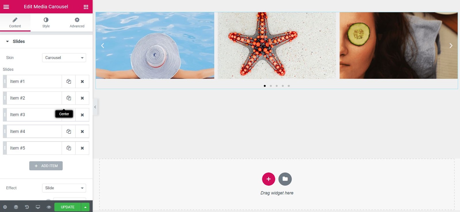
Content
Slides
- Skin: Carousel
- Slides: Choose the image or video to display and set the URL to link to
- Effect: Choose how each slide transitions, either Slide, Fade, or Cube
- Slides Per View: Set number of slides to view at one time, maximum of 10
- Slides to Scroll: Set number of slides to scroll per swipe, maximum of 10
- Height: Set the height of the carousel
- Width: Set the width of the carousel
Additional Options
- Arrows: Choose to show or hide the navigation arrows
- Pagination: Select None, Dots, Fraction, or Progress
- Transition Duration: Set the time it takes for each slide to appear. This time is in milliseconds, so 1000 ms is equal to 1 second.
- Autoplay: Show or hide
- Autoplay Speed: Set the time between each slide. This time is in milliseconds, so 1000 ms is equal to 1 second.
- Infinite Loop: Show carousel in continuous loop, infinitely. Yes or No
- Pause on Interaction: Select whether or not to pause autoplay when a user interacts with the carousel. Yes or No
- Overlay: Select overlay type, when user hovers over a slide. None, Text, or Icon
- Image Size: Select size of image, from Thumbnail to Full, or Custom
- Image Fit: Select how image fits into its container, either Cover, Contain, or Auto
Slideshow Skin
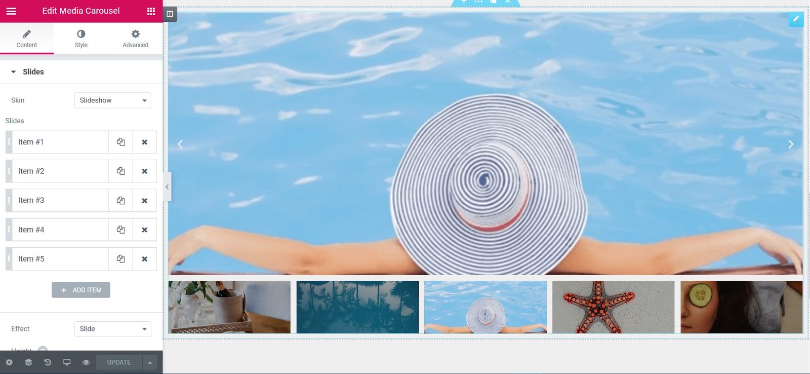
Content
- Skin: Slideshow
- Slides: Choose the image or video to display and set the URL to link to
- Effect: Choose how each slide transitions, either Slide, Fade, or Cube
- Height: Set the height of the carousel
- Thumbnails:
Slides Per View: Number of slides, per view, maximum of 10
Ratio: Select from 1:1, 4:3, 16:9, or 21:9
Additional Options
- Arrows: Choose to show or hide the navigation arrows
- Transition Duration: Set the time it takes for each slide to appear. This time is in milliseconds, so 1000 ms is equal to 1 second
- Autoplay: Show or hide
- Autoplay Speed: Set the time between each slide. This time is in milliseconds, so 1000 ms is equal to 1 second
- Infinite Loop: Show carousel in continuous loop, infinitely. Yes or No
- Pause on Interaction: Select whether or not to pause autoplay when a user interacts with the carousel. Yes or No
- Image Size: Select size of image, from Thumbnail to Full, or Custom
- Image Fit: Select how image fits into its container, either Cover, Contain, or Auto
Coverflow Skin

Content
- Skin: Coverflow
- Slides: Choose the image or video to display and set the URL to link to
- Slides Per View: Set number of slides to view at one time, maximum of 10
- Slides to Scroll: Set number of slides to scroll per swipe, maximum of 10
- Height: Set the height of the carousel
- Width: Set the width of the carousel
Additional Options
- Arrows: Choose to show or hide the navigation arrows
- Pagination: Select None, Dots, Fraction, or Progress
- Transition Duration: Set the time it takes for each slide to appear. This time is in milliseconds, so 1000 ms is equal to 1 second.
- Autoplay: Show or hide
- Autoplay Speed: Set the time between each slide. This time is in milliseconds, so 1000 ms is equal to 1 second.
- Infinite Loop: Show carousel in continuous loop, infinitely. Yes or No
- Pause on Interaction: Select whether or not to pause autoplay when a user interacts with the carousel. Yes or No
- Overlay: None, Text, or Icon
- If Text is chosen:
Caption: Choose which text to display as the caption – Title, Caption, or Description
Animation: Choose from Fade, Slide Up, Slide Down, Slide Right, Slide Left, Zoom In - If Icon is chosen:
Icon: Choose from a search icon, plus icon, eye icon, or link icon - Animation: Choose from Fade, Slide Up, Slide Down, Slide Right, Slide Left, Zoom In
- Image Size: Select size of image, from Thumbnail to Full, or Custom
- Image Fit: Select how image fits into its container, either Cover, Contain, or Auto
Style
Slides
- Space Between: Set the space between slides
- Background Color: Choose a background color for the carousel
- Border Size: Control the thickness of the border
- Border Color: Choose a color for the border
- Padding: Set the padding
- Border Radius: Set the border radius to control corner roundness
Navigation
Arrows
- Size: Scale arrow size up or down
- Color: Choose the color for the arrows
Pagination (not available on Slideshow type)
- Position: Place pagination outside or inside of slides
- Size: Scale pagination size up or down
- Color: Set the color of the pagination
Play Icon (You must have videos in the slides to see it)
- Color: Set the color of the video play icon
- Size: Set the size of the video play icon
- Text Shadow: Set the text shadow of the video play icon
Overlay (not available on Slideshow type)
If Text was chosen for the Overlay:
- Background Color: Choose a background color for the overlay
- Text Color: Choose the color of the overlay text
- Typography: Change the typography options for the overlay text
If Icon was chosen for Overlay:
- Background Color: Choose a background color for the overlay
- Text Color: Choose the color of the overlay icon
- Icon Size: Scale the size of the overlay icon up or down
Lightbox
- Color: Choose the lightbox background color
- UI Color: Choose the UI Color. This affects the lightbox arrow and dot navigations and the X closing icon.
- UI Hover Color: Choose the UI hover color. This affects the lightbox arrow and dot navigations and the X closing icon when the user hovers over each.
- Video Width: Set the width of the video
Note: Autoplay is affected by Google’s Autoplay policy on Chrome browsers.
Note: Using Elementor template shortcodes within the widget may sometimes work, but it is not a supported feature.
Advanced
Set the Advanced options that are applicable to this widget
The Sitemap widget creates a structured, organized, and accessible HTML sitemap of your website, which provides users and search engines easy, one-click access to your site’s pages.
Content
Sitemap
Items
- Type: Select either Post Type or Taxonomy
- Source: Choose Posts, Pages, or any available custom post types if Post Type was selected. Choose Categories, Tags, Format, or any available custom taxonomies if Taxonomy was selected.
- Title: Enter a title
- Order By: Choose how to order the links. For Post Type selection, choose from Date, Title, Menu Order, or Random. For Taxonomy selection, choose from ID or Name.
- Order: Choose to list the links in ascending (ASC) or descending (DESC) order
- Hide Empty: If type chosen is Taxonomy, this option is available. Set to YES to hide if taxonomy is empty
- Hierarchical View: Set to YES to show hierarchical view (both parents and children).
- Max Depth: If Hierarchical View is set to YES, this option becomes available. Select depth of hierarchy to show, from 1 to 6, or ALL.
- Columns: Adjust the number of columns, from 1 to 6
- Title HTML Tag: Set the Title tag to H1-H6, Div, Span or Paragraph
- Add nofollow: Slide to YES to add rel=”nofollow” to all sitemap links
Additional Options
- Exclude: Choose to exclude the current post or manually search and select a post to exclude
- Avoid Duplicates: Choose Yes to avoid displaying duplicate posts that might appear in multiple categories
- Protected Posts: Choose to HIDE or SHOW protected posts
Style
List
- Indent: Set the amount of indentation within the lists
- Padding: Set the padding around the sitemap columns
Title
- Color: Choose the color of the title’s text
- Typography: Change the typography options for the title
List Item
- Color: Choose the color of the page links
- Typography: Change the typography options for the page links
Bullet
- Color: Choose the color of the list bullets
- Style: Select the type of list bullet, choosing from Disc, Circle, Square, or None

A Global Widget gives you full control over a specific widget that is displayed in multiple places on your site. Editing it in one place will instantly update the rest.
For example, let’s say you’ve edited and designed a Testimonial widget on one page, and you now want to use your creation on many other pages on your site. Simply save it as a Global Widget and then drag your new widget onto any page. You can then edit all of them at once by editing the global widget.
Create a Global Widget
- Right Click the widget’s handle and click on Save as a Global
- Name your new global template and click the Save button
Edit a Global Widget
Once the widget is saved as a global widget it is instantly surrounded by a yellow border instead of the standard blue border. In addition, in the panel, all of the saved global widgets are displayed as a two column widget list.
To edit the global widget, Right Click the widget’s handle 
You’ll see the message “ This is a global widget and is now locked”
- Clicking Edit global widget allows editing the global widget. Any changes made here will instantly update all the places in which the global widget is placed on the site
- Clicking Unlink from global will unlink the widget from the rest of the global widgets, and let you edit only the specific widget, without affecting all other global widgets.
Insert a Global Widget
There is a number of ways to insert a global widget to other places on your site:
Elementor Dashboard:
- On the new page click Global, and drag a global widget to your page.
WordPress widgets area:
- Go to Appearance > Widgets
- Add the Elementor Library Widget to the area you want (footer, sidebar, etc.)
- Click the dropdown and pick the template or global widget you want to use.
Shortcode
- Go to Templates > Saved Templates > Global Widget.
- Copy the Shortcode
- Paste it in any area that supports shortcodes.
How to delete the Global Widget
Go to
Templates > Saved Templates
and delete the widget.
Important! Notice that deleting a Global Widget will delete it from everywhere.
The Slides widget allows you to quickly create simple slides that work perfectly, without a fuss.
Content
Background
- Color: Set the background color for the slide
- Image: Choose an image from the media library
If an image is chosen as a slide background, additional options appear:
- Size: Choose whether to display the background as cover or auto. The auto image is for situations where you have the exact sizes needed, and also where you would want the entire image to appear in the slider. The cover size is for more abstract and atmospheric images, where the showing of the entire image is less important.
- Ken Burns Effect: Choose YES to enable this popular zooming effect on the background image.
- Background Overlay: Choose YES to set a background overlay that will appear on top of the image. If set to YES, you have the option of choosing the overlay’s color.
Content
- Title & Description: Insert the title and description for the slide
- Button Text: Set the text for the button
- Link: Add a URL the slide or button will link to
- Apply Link On: If a link is set, this option appears. Choose if the link applies to only the button or to the whole slide
Style
Styling for individual tabs is OFF by default, relying on the global styles which are set on the widget’s Style tab. If you wish to override the global slide styles, turn the Custom switch to ON. This will enable you to set custom styles for that individual slide. The custom styles for individual slides are:
- Horizontal Position: Position the content horizontally: Left, right or center
- Vertical Position: Position the content to the top, middle or bottom
- Text Align: Align the text left, center or right
- Content Color: Choose the color of the content
- Height: Set the exact height of the slide in either PX, VH, or EM
Slider Options
- Navigation: Choose to display arrows, dots, both or none
- Pause on Hover: Make the slide pause when the mouse hovers over it
- Autoplay: Get the slides to rotate automatically, according to the speed you set
- Autoplay Speed: Set the time it takes for the slide to start rotating
- Infinite Loop: Have the slides rotate in an infinite loop and without stopping
- Direction: Choose a direction for the slider as left or right
- Transition: Set the transition of the slides as slide or fade
- Transition Speed: Set the time it takes for the slides to rotate
- Content Animation: Set the animation effect of the content’s display when the slide is shown: None, Down, Up, Right, Left, or Zoom
Style
Slides
- Content width: Set the width of the content inside the slide
- Padding: Set the inner spacing between the edge of the content and the edge of the slide
- Horizontal Position: Set the position of the content as right, left and center
- Vertical Position: Set the position of the content as top, middle or bottom
- Text Align: Align the text to the right, left or center
- Text Shadow: Add a shadow and blur to the text
Note: If an individual slide has Custom styles set, these global styles will have no effect upon that slide.
Title
- Spacing: Set the spacing between the title and the description
- Text Color: Set the color of the title
- Typography: Set the typography of the title
Description
- Spacing: Set the spacing between the description and the button
- Text Color: Set the color of the description
- Typography: Set the typography of the description
Button
- Size: Set the size of the button, from extra small to extra large
- Text Color: Set the text color for the button
- Typography: Set the typography of the button
- Border Width: Set the border width of the button
- Border Radius: Set the border radius, to control corner roundness
- Text Color – Set the text color
- Background Color – Set the background color of the button
- Border Color – Set the border color of the button
Navigation
- Arrows position – Set the position of the arrows inside or outside the slider
- Arrows size – Set the exact size of the arrows
- Arrows color – Set the color of the arrows
- Dots Position – Set the position of the dots inside or outside the slider
- Dots size – Set the exact size of the dots
- Dots color – Set the color of the dots
Note: Autoplay is affected by Google’s Autoplay policy on Chrome browsers.
Note: Using Elementor template shortcodes within the widget may sometimes work, but it is not a supported feature.
Advanced
Set the Advanced options that are applicable to this widget
Add your Facebook Page Feed (previously named Like box) to your site.

- URL: Type your Facbook Page URL
- Layout: Choose between Timeline, Events and Messages
- Small header: Displays a Facebook Header in a narrow view
- Cover: Show / hide the cover image
- Profile photos: Show photos of people who liked your page
- Custom CTA button: Choose between the page’s official CTA button, or the default Share Button
- Height: Set the height of the box (desktop, tablet and mobile)
Advanced
Set the Advanced options that are applicable to this widget
The Search Form widget allows you to add a search bar anywhere on your website.
Content
Search Form
- Skin: Choose classic, minimal or full-screen pre-built styles
- Placeholder: Set the text that appears inside the search form
Full-screen shows only a small button which opens the search form as a lightbox popup
Button or Toggle
- Type: Choose to display an Icon or Custom Text on the button
- Icon or Text: If using an icon on the button, choose from a search or arrow icon. If using custom text, specify the text that will appear on the button
- Size: Adjust the size of the button or search icon
- Alignment (for full-screen skin only): Align the search icon to the left, center, or righ
Style
Input
- Overlay Color (for Full Screen skin only): Select the color of the full screen overlay
- Typography: Change the typography options of the search bar for both normal and focused modes
- Text color: Choose the color of the text
- Background color: Choose the background color
- Border color: Choose the border color
- Box-shadow: Give the search bar a box shadow
- Border size: Control the thickness of the border
- Border radius: Set the border radius to control corner roundness
Button or Toggle
- Text color: Choose the color of the text
- Background color: Choose the background color of the button
- Icon size: Scale the icon size up and down
- Width: Adjust the width of the button
- Border Width: Control the thickness of the border
- Border Radius: Set the border radius to control corner roundness
Advanced
Set the Advanced options that are applicable to this widget
The Facebook Embed widget lets you easily embed Facebook posts, videos or comments on your website’s page.

The following options are available depending upon which type of embed is chosen: Post, Video, or Comment.
Post Embed
- URL: Choose which URL will be embedded in the page
- Full post: Switch ON to show full text of the post, or OFF to show the shorter post text
Video Embed
- URL: Choose which URL will be embedded in the page
- Full Post: Switch ON to show full text of the post, or OFF to show the shorter post text
- Allow Full Screen: Switch ON to allow video in Full Screen
- Autoplay: Switch ON to automatically play the video
- Captions: Switch ON to show the Captions of the video if available (shown only on desktop devices)
Comment Embed
- URL: Choose which URL will be embedded in the page
- Parent comment: Switch ON to include the parent comment, if the comment being embedded is a reply
Note: Autoplay is affected by Google’s Autoplay policy on Chrome browsers.
Advanced
Set the Advanced options that are applicable to this widget
The Page Title widget is a dynamic widget that displays the Page Title that was assigned in the WordPress page editor.

Content
- Title: The title is automatically, dynamically retrieved for you
- Link: The link is automatically, dynamically retrieved for you
- Size: Select the size of the Page Title, from Small to XXL
- HTML Tag: Set the Page Title’s tag to H1-H6, Div, Span or Paragraph
- Alignment: Align the Page Title to the left, right, center, or justified
Style
- Text Color: Choose the color of the Page Title’s text
- Typography: Change the typography options for the Page Title’s text
- Text Shadow: Add a shadow and blur to the Page Title’s text
- Blend Mode: Select from multiple layer effects including Normal, Multiply, Screen, Overlay, etc.
The Reviews widget displays a sliding carousel of user reviews.
Content
Slides
Items
Shows a list of all the items in the slide. You can drag and drop them to change their order. Click on the Add Item button to add another item to the list.
Tip: Quickly duplicate or delete items by clicking an item’s Duplicate or Delete icon
- Image: Upload or choose the reviewer’s image
- Name: Enter the reviewer’s name
- Title: Enter the reviewer’s job title
- Rating: Assign a numerical rating, from 0.0 to 5.0
- Icon: Choose the type of icon to use, either Font Awesome or Unicode
- Link: Link the review to a URL
- Review: Enter the text of the review
- Slides Per View: Select the number of slides to show at one time, from 1 to 10
- Slides to Scroll: Select how many slides to scroll per swipe, from 1 to 10
- Width: Set the width of the carousel, in percentage or pixels
Additional Options:
- Arrows: Show or hide the navigation arrows
- Pagination: Select the carousel pagination style, either None, Dots, Fraction, or Progress
- Transition Duration: Set the time between slide movement, in milliseconds
- Autoplay: Slide to YES to have the carousel slide automatically
- Autoplay Speed: Set the speed at which the carousel will slide, in milliseconds
- Infinite Loop: Set to YES to have the carousel continue sliding, infinitely
- Pause on Interaction: Set to YES to have the autoplay pause when the carousel is hovered over with a mouse or clicked
- Image Size: Set the size of the image, from thumbnail to full, or enter a custom size
Style
Slides
- Space Between: Control the space between review items
- Background Color: Choose the background color of the review card
- Border Size: Set the thickness of the border around the review card
- Border Radius: Set the border radius to control corner roundness
- Border Color: Choose a color for the border
- Padding: Set the padding within the border of the review card’s box
Header
- Background Color: Choose the background color of the review card’s header
- Gap: Control the space between the Header and the Review text
- Separator: Choose to show or hide the separator line between the header and the review text
- Color: Choose the color of the separator line
- Size: Set the height of the separator line
Text
Name / Title / Review
- Color: Choose the color of the Name/Title/Review
- Typography: Change the typography options for the Name/Title/Review
Image
- Image Size: Adjust the size of the reviewer’s image
- Image Gap: Control the space between the image and the reviewer’s profile information
- Border Radius: Set the border radius to control corner roundness
Icon
- Color: Set the color of the social icon. Choose either the Official Color of the social network, or set a custom color of your choice
- Size: Adjust the size of the social icon
Rating
- Icon: Choose the type of icon to use, either Font Awesome or Unicode
- Unmarked Style: Choose Solid or Outline for unmarked icons
- Size: Set the size of the rating stars
- Spacing: Adjust the amount of space between each star
- Color: Choose the color of the rating stars
- Unmarked Color: Choose the color of the unmarked portion of the stars
Navigation
Arrows / Pagination
- Size: Adjust the size of the navigation arrows
- Color: Choose the color of the navigation arrows

Note: Autoplay is affected by Google’s Autoplay policy on Chrome browsers.
The Site Title widget is a dynamic widget that displays the Site Title that was assigned in the WordPress Customizer. Although the site’s title can only be replaced or deleted in the WordPress Customizer, the Site Title widget gives you the ability to change some design aspects of the title.

Content
- Title: The title is automatically, dynamically retrieved for you
- Link: The link is automatically, dynamically retrieved for you
- Size: Select the size of the Site Title, from Small to XXL
- HTML Tag: Set the Site Title’s tag to H1-H6, Div, Span or Paragraph
- Alignment: Align the Site Title to the left, right, center, or justified
Style
- Text Color: Choose the color of the Site Title’s text
- Typography: Change the typography options for the Site Title’s text
- Text Shadow: Add a shadow and blur to the Site Title’s text
- Blend Mode: Select from multiple layer effects including Normal, Multiply, Screen, Overlay, etc.
The Login Widget makes it easy to create a custom login page, instead of the default WordPress login page.
How to add a login page to WordPress
Create a New Page, and add the Login Widget

Form fields
- Label: Show or Hide the form Label
- Input size: Choose the Form Fields input size.
Button
- Text: Type the button’s text
- Size: Choose the size of the button
- Alignment: Set the button’s alignment
Additional options
- Redirect After Login: Set to ON or OFF.
- Lost Your Password: Choose whether or not to display the “Lost Your Password” link
- Remember me: Choose whether or not to display the “Remember Me” checkbox
- Logged in message: Choose whether or not to display the a Logged In user a message
- Custom label: Change the default form label and placeholder text
Style
Form
- Rows Gap: Set the exact gap between each row
- Links Color: Choose the color of the links
- Links Hover Color: Choose the color of the links when hovered over
Label
- Spacing: Set the exact gap between the label and its corresponding field
- Text Color: Choose the color of the label text
- Typography: Set the typography options for the label text
Fields
- Text Color: Choose the color of the text within the fields
- Typography: Set the typography options for the text within the fields
- Background Color: Choose the background color of the fields
- Border Color: Choose the border color of the fields
- Border Width: Set the thickness of the border around the fields
- Border Radius: Set the border radius to control corner roundness of the fields
Button
Normal | Hover
The following options can be set independently for both the normal and hover states.
- Text Color: Choose the color of the button’s text
- Typography: Set the typography options for the button’s text
- Background Color: Choose the background color of the button
- Border Type: Select the type of border, choosing from none, solid, double, dotted, dashed, or grooved
- Border Radius: Set the border radius to control corner roundness of the button
- Text Padding: Set the amount of padding around each side of the text in the button
Advanced
Set the Advanced options that are applicable to this widget
Note: Use your regular WordPress login credentials with the Login Widget
Add Facebook Comments to the end of your posts to allow your readers to easily comment using their Facebook account.
Content
Comments Box
- Comment Count: Set the number of comments displayed in the page
- Order By: Sort the comments order according to the Facebook Social factor, Time or Reverse Time
- Target URL: Get the Comments of the Current Page, or for a Custom URL
- URL Format: Select Plain Permalink or Pretty Permalink
Advanced
Set the Advanced options that are applicable to this widget
Note: Set your Facebook App ID in the Elementor Settings > Integrations tab.
The Blockquote Widget allows you to embed fully styled quotes. You can also set these as Click To Tweet quotes, enabling users to easily share them on Twitter.
Content
- Skin: Choose the Blockquote skin, selecting either Border, Quotation, Boxed, or Clean
- Alignment: (available for Quotation, Boxed and Clean Skins) Align the quote elements to the left, center, or right
- Content: Type your Blockquote content
- Author: Enter the Author name
- Tweet Button: Toggle the Tweet Button ON or OFF
Tweet Button Settings:
- View: Choose between Icon & Text, Icon, or Text only
- Skin: Choose between Classic, Bubble and Link
- Label: Type your Label
- Via: Type your Twitter Account username i.e. @your_acount
- Target URL: Choose between the Current Page, None, or a Custom Link
Style
Content
- Text Color: Choose the color of the quotation text
- Typography: Set the typography options for the quotation text
- Gap: Set the amount of spacing between the quotation text and the author
Author
- Text Color: Choose the color of the author’s name
- Typography: Set the typography options for the author’s name
Button
- Size: Adjust the size of the button
- Border Radius: Set the border radius to control corner roundness
- Color: Select the Official Twitter colors or set your own custom button colors
- Typography: Set the typography options for the button text
If Custom Color option is chosen, the following options become available:
- Background Color: Choose the background color of the button
- Text Color: Choose the color of the button’s text
- Typography: Set the typography options for the button text
Border (available only for the Border skin)
- Color: Choose the color of the border
- Width: Set the border’s width
- Gap: Set the space between the left border and the quote text
- Vertical Padding: Set the top and bottom padding around the content
Quote (only available for Quotation skin)
- Color: Choose the color of the quotation mark
- Size: Set the size of the quotation mark
- Gap: Set the spacing between the quotation mark and the quote text
Box (only available for Boxed skin)
- Padding: Set the padding around the quote text
- Background Color: Choose the background color of the box
- Border Type: Select the border type from Solid, Double, Dotted, Dashed, or Groove
- Border Radius: Set the border radius to control corner roundness
- Box Shadow: Adjust box shadow options
Advanced
Set the Advanced options that are applicable to this widget
The Flip Box Widget helps you create animated boxes that flip to the other side, once the visitor hovers over them.
Content
Front
Content
This tab controls the content of the front side of the flip box.
- Graphic Element: Choose between None, Image or Icon to display a graphical Element in the front of the flip box
- If Image is selected as the Graphic Element:
Choose Image: Select or upload an image
Image Size: Set the size of the image, from thumbnail to full, or set a custom size - If Icon is selected as the Graphic Element:
Icon: Select an icon from the FontAwesome library
View: Choose the default icon view, or select Stacked or Framed
Shape: If Stacked or Framed is chosen, choose Circle or Square - Title & Description: Choose the title and description that appears in the front of the flip box
Background
This tab controls the background of the front side of the flip box.
Background Type: Choose Color, Image or Gradient as the background of the front of the flip box.
If you choose an Image Background, the following options become available:
- Position: Select the position of the image, such as Top Center, Top Right, Center Center, etc.
- Attachment: Select from Default, Scroll, or Fixed
- Repeat: Choose from Default, No-repeat, Repeat, Repeat-x, or Repeat-y
- Size: Select from Default, Auto, Cover, or Contain
- Background Overlay: Choose a color for the overlay
If you choose Gradient Background, the following options become available:
- Color: Select the primary color of the gradient
- Location: Select the location of the primary color
- Second Color: Select the second color of the gradient
- Location: Select the location of the second color
- Type: Choose Linear or Radial
- Angle: Set the angle of the gradient
Back
The back side of the flip box has the same elements as the front side listed above, except for the graphic element that only appears on the front. The back side also includes a button.
- Button Text: Choose the text that appears inside the button
- Link: Choose where the button points to. The link needs to include the entire URL (including http / https)
- Apply Link On: Choose to apply the clickable link to the Button Only, or to the Whole Box
Settings
- Height: Control the height of the flip box
- Border Radius: Set the border radius of the flip box, and make its corners round
- Flip Effect: Choose between flip effects, including flip, slide, push, zoom in, zoom out or fade
- Flip Direction: If you choose the flip or slide effects, you can have the flip box flip right, left, up or down
- 3D Depth: Slide to On to give the flip box a 3D animation effect

Note: The Safari browser is partially incompatible with the 3D Depth effect on mobile. If 3D Depth is used, portions of the flip box may show through the Nav Menu dropdown. It is not possible to use the 3D Flip Box widget and the Nav Menu widget with IOS due to issues with Safari being unable to support this option. We advise modifying the content for mobile in this case with the “hide section” option in the section’s Advanced tab in Responsive > Visibliity.
Style
Front Side
- Padding: Add padding to the content area of the front of the flip box
- Alignment: Choose to align the flip box content to the left, right or center of the flip box
- Vertical Position: Align the flip box content to the top, center or bottom of the flip box
- Border Type: Set a border to the entire flip box
- Width: If a border type is chosen, set a width for the border
- Color: If a border type is chosen, select a color for the border
Icon
- Spacing: Control the space between the icon and the title
- Primary Color: Choose the primary color of the icon
- Secondary Color: Choose the secondary color of the icon
- Icon Size: Choose the size of the icon
- Icon Padding: Set the amount of padding around the icon
- Icon Rotate: Rotate the icon to any angle
- Border Width: Set the width of the icon border
- Border Radius: Set the radius of the icon border to control corner roundness
Image
- Spacing: Control the space between the image and the title
- Opacity: Choose the opacity of the image
- Border Type: Choose a border for the image: None, Solid, Double, Dotted, Dashed, or Groove
- Border Radius: Control the border radius of the image border
Title
- Spacing: Control the space between the title and description
- Text Color: Choose the color of the title
- Typography: Set the typography settings of the title
Description
- Text Color: Choose the color of the description
- Typography: Set the typography settings of the description
Back Side
For the back side of the flip box, you get all the options listed previously for the front side, minus the graphical element settings. You also get control over the button settings.
Button
- Size: Choose a size for the button (extra small, small, medium large and extra large)
- Typography: Customize the typography of the button text
- Text Color: Choose the text color of the button
- Background Color: Choose the color of the button background
- Border Color: Control the color of the button border
- Border Width: Control the width of the button border
- Border Radius: Control the border radius of the button
Advanced
Set the Advanced options that are applicable to this widget
The Price List widget lets you create fully styled catalogs and menus that include pricing.
Content
List Items
Shows a list of all the items in the widget. You can drag and drop them to change their order. Click on the Add Item button to add another item to the list.
Tip: Quickly duplicate or delete items by clicking an item’s Duplicate or Delete icon
By clicking on each item you can customize their content and settings, which are:
- Price: Add the price of the item
- Title & Description: Set the title and description of the item
- Image: Choose an image from the media library
- Link: Enter the URL for the item’s link. Click the Link Options cog to either add rel=nofollow to the link or to open the link in a new window
Style
List Style
Title & Price
- Color: Choose a color for the title and price
- Typography: Set the typography options for the title and price
Description
- Color: Choose a color for the description
- Typography: Set the typography options for the description
Separator
- Style: Choose the style of the separator between the title and the price, selecting from solid, dotted, dashed, double or none
- Weight: Set the weight of the separator
- Color: Choose a color for the separator
- Spacing: Increase or decrease the space to the left and right of the separator
Image Style
- Image Size: Choose the size of the image, from thumbnail to full, or set a custom size
- Border Radius: Set the border radius of the image, to control corner roundness
- Spacing: Set the spacing between the image and the content
Item Style
- Rows Gap: Set the spacing between each item
- Vertical Align: Choose either top, bottom or center alignment for the content, in relation to the image
Advanced
Set the Advanced options that are applicable to this widget