Elementor offers a set of widgets called ‘Theme Elements‘ that can be used to create your single post. These include the Post Title widget, Post Info (Meta Data) widget, Post Excerpt widget, Post Content widget, Featured Image widget, Search Form widget, Author Box widget, Post Comments widget, Post Navigation widget, and Breadcrumbs widget (if Yoast SEO plugin is installed and active).
You can learn more about these widgets below

Post Title: The title of the current post.
Post Info (Meta): The current post’s meta data such as Author, Date, Time, and Number of Comments.
Post Excerpt: The short summary of the current post.
Post Content: The heart of the current post is the content, of course!
Featured Image: The featured image of the current post.
Author Box: A box which features the author’s bio.
Search Form: A search form to help users find content on your site.
Post Comments: A user comments section.
Post Navigation: Navigation to allow users to easily navigate between posts.
Breadcrumbs: Breadcrumbs which enable users to navigate your site easily, while also providing search engines clues as to the structure of your site. (Requires Yoast SEO plugin).
Read the tutorial showing how to Create a Single Post Template
With the Posts Widget you can display a list of any post types, including custom post types, in various layouts and ways. This practical widget can be used to display posts from a particular category or other taxonomy, recent posts, and more.
Classic Skin
The Classic skin is a fully customizable layer template that gets applied to the Posts widget, giving your posts a traditional design style.

Content
Layout
- Skin: Select a pre-designed skin, either Classic, Cards, or Full Content
- Columns: Set how many columns will be displayed, from 1 to 6
- Posts Per Page: Set the exact amount of posts displayed
- Image Position: Set the image position, relative to the content. Options include: Top / left / right / none. *See Note below for instructions to set image position on mobile.
- Masonry: Slide on or off
- Image Size: Set the size of the image, from thumbnail to full
- Image Ratio: Set the exact ratio of the images
- Image Width: Set the exact width of the images
- Title: Choose to show or hide the title
- Title HTML Tag: Select the HTML tag to use for the title, from H1 to H6, or div, span, or p
- Excerpt: Choose to show or hide the excerpt
- Excerpt Length: Choose the length of the excerpt, setting the exact amount of words displayed
- Meta Data: Select the meta data to be displayed in the widget. A click on the field opens the list of options. The options include author, date, time and comments
- Separator Between: Choose the separator you want to use between the meta data
- Read More: Show or hide the Read More button
- Read More Text: Customize the Read More text
- Open in New Window: Choose Yes to open posts in a new tab.
Note: Adjust Image Width and Image Ratio in desktop and mobile view as shown below.
Note: In regards to the Posts Per Page option, please be aware that the Posts widget will load all sticky posts + the number of posts per page that you set in the Posts Per Page option. This is how WordPress fundamentally treats sticky posts. For example, if you set Posts Per Page = 1 but you have 5 sticky posts, then the total number of posts loaded on the front end would be 6 (1+5=6}.
Note: When Elementor displays a post, if it has no excerpt, Elementor automatically generates an excerpt from the post’s content. The Excerpt Length option allows you to control the length of this auto-generated excerpt. However, the excerpt length only applies to posts in which no manual excerpt has been entered. The length specified in the Elementor widget is ignored if a manually-generated excerpt exists for a post.

Query
Source: Select the source from which the widget will display the content. Options include Posts, Pages, Custom post types if available, Manual Selection, Current Query, and Related. Depending upon which source you’ve chosen for the query, you’ll be given options which allow you to filter the results.

Include
- Include By: Term or Author, then use Search and Select to choose which ones to use. Terms include all of the items in a taxonomy. The available taxonomies are: categories, tags, formats and custom taxonomies.
- Date: Select from All, Past Day, Past Week, Past Month, Past Quarter, Past Year, Custom (Choose Before or After dates)
- Order By: Set the order in which the posts will be displayed. Options include: Date, Title, Menu Order, or Random
- Order: DESC (descending) or ASC (ascending)
- Ignore Sticky Posts: Yes or No (Sticky Posts option works only if zero terms have been selected)
- Query ID: Give your Query a custom unique ID to allow server side filtering
Note: Choosing Related as the Source and Category as the Include By term will display posts related to the category assigned to the current post being displayed. So if the user is viewing a post in the Travel category, for example, the page will show Related posts which are also in the Travel category. If the post currently displayed has multiple categories assigned to it, the Related posts will pull posts from the FIRST category (alphabetically) assigned to the post. Important Exception: Keep in mind that if you set a Fallback for Related Posts, it will not take the query into account. Once you select a fallback as shown below, it will pull and display all the latest posts.

Exclude
These settings become available once you select Exclude
- Exclude By: Current Post, Manual Selection, Term, or Author, then use Search and Select for Manual,Term, or Author choices
- Avoid Duplicates: Yes or No – Choose Yes to avoid displaying duplicate posts on the frontend only. Elementor looks for duplicates at the page level (not at the widget level) given that there cannot be duplicates in a Posts widget.
- Offset: Use this setting to skip over posts (e.g. “2” to skip over 2 posts).
- Date: All, Past Day, Past Week, Past Month, Past Quarter, Past Year, Custom (Choose Before or After dates)
- Order By: Date, Title, Menu Order, or Random
- Order: DESC (descending) or ASC (ascending)
- Ignore Sticky Posts: Yes or No (Sticky Posts option works only if zero terms have been selected)
- Query ID: Give your Query a custom unique ID to allow server side filtering. See the developer docs for more information on how to use this advanced feature.
Pagination
Pagination: Choose how you wish to paginate the results. Options include None, Numbers, Previous/Next, or Numbers + Previous/Next.
Style
Layout
- Columns Gap: Set the exact gap between the columns
- Rows Gap: set the exact gap between the rows
- Alignment: Set the alignment of the content in the widget as left, center or right
Box
- Border Width: Set the thickness of the border around the post’s box
- Border Radius: Set the roundness of the border corners of the post’s box
- Padding: Set the padding within the border of the post box
- Content Padding: Add additional padding around just the content of the post box
- Box Shadow: Set the box shadow options around the post box for both normal and hover modes
- Background Color: Choose the background color of the post box for both normal and hover modes
- Border Color: Choose the border color of the post box for both normal and hover modes
Image
- Border Radius: Set the roundness of the edges of the images
- Spacing: Set the exact spacing between the image and the content
- CSS Filters: Adjust the image style by changing the CSS Filter scales for Blur, Brightness, Contrast, Saturation, and Hue settings
Content
Title
- Color: Set the color of the titles
- Typography: Set the typography of the titles
- Spacing: Set the spacing between the title and the content
Meta
- Color: Set the color of the meta data
- Separator Color: Set the color of the meta data separator
- Typography: Set the typography for the meta data
- Spacing: Set the spacing between the meta data and the excerpt
Excerpt
- Color: Set the color of the excerpt
- Typography: Set the typography of the excerpt
- Spacing: Set the spacing between the excerpt and the read more
Read More
- Color: Set the color of the read more
- Typography: Set the typography for the read more text
- Spacing: Set the spacing between the read more text and the bottom of the post box
Cards Skin
The Cards Skin is a customizable pre-designed layer template that gets applied to the Posts widget, giving your posts a trendy material design style.

Content
Layout
- Skin: Select a pre-designed skin, either Classic, Cards, or Full Content
- Columns: Set how many columns will be displayed, from 1 to 6
- Posts Per Page: Set the exact amount of posts displayed
- Show Image: Choose to show or hide the featured image
- Masonry: Slide on or off
- Image Size: Set the size of the image, from thumbnail to full
- Image Ratio: Set the exact ratio of the images
- Title: Choose to show or hide the title
- Title HTML Tag: Select the HTML tag to use for the title, from H1 to H6, or div, span, or p
- Excerpt: Choose to show or hide the excerpt
- Excerpt Length: Choose the length of the excerpt, setting the exact amount of words displayed
- Meta Data: Select the meta data to be displayed in the widget. A click on the field opens the list of options. The options include author, date, time and comments
- Separator Between: Choose the separator you want to use between the meta data
- Read More: Show or hide the Read More button
- Read More Text: Customize the Read More text
- Badge: Show or hide the Badge. The badge lets you show the category, tag or other taxonomy inside the card
- Avatar: Show or hide the user avatar of the post’s author
Note: In regards to the Posts Per Page option, please be aware that the Posts widget will load all sticky posts + the number of posts per page that you set in the Posts Per Page option. This is how WordPress fundamentally treats sticky posts. For example, if you set Posts Per Page = 1 but you have 5 sticky posts, then the total number of posts loaded on the frontend would be 6 (1+5=6}.
Note: When Elementor displays a post, if it has no excerpt, Elementor automatically generates an excerpt from the post’s content. The Excerpt Length option allows you to control the length of this auto-generated excerpt. However, the excerpt length only applies to posts in which no manual excerpt has been entered. The length specified in the Elementor widget is ignored if a manually-generated excerpt exists for a post.
Query
Source: Select the source from which the widget will display the content. Options include Posts, Pages, Custom post types if available, Manual Selection, Current Query, and Related. Depending upon which source you’ve chosen for the query, you’ll be given options which allow you to filter the results.
Include
- Include By: Term or Author, then use Search and Select to choose which ones to use. Terms include all of the items in a taxonomy. The available taxonomies are: categories, tags, formats and custom taxonomies.
- Date: Select from All, Past Day, Past Week, Past Month, Past Quarter, Past Year, Custom (Choose Before or After dates)
- Order By: Set the order in which the posts will be displayed. Options include: Date, Title, Menu Order, or Random
- Order: DESC (descending) or ASC (ascending)
- Ignore Sticky Posts: Yes or No (Sticky Posts option works only if zero terms have been selected)
- Query ID: Give your Query a custom unique ID to allow server side filtering
Note: Choosing Related as the Source and Category as the Include By term will display posts related to the category assigned to the current post being displayed. So if the user is viewing a post in the Travel category, for example, the page will show Related posts which are also in the Travel category. If the post currently displayed has multiple categories assigned to it, the Related posts will pull posts from the FIRST category (alphabetically) assigned to the post. Important Exception: Keep in mind that if you set a Fallback for Related Posts, it will not take the query into account. Once you select a fallback as shown below, it will pull and display all the latest posts.
Exclude
These settings become available once you select Exclude
- Exclude By: Current Post, Manual Selection, Term, or Author, then use Search and Select for Manual,Term, or Author choices
- Avoid Duplicates: Yes or No – Choose Yes to avoid displaying duplicate posts on the frontend only. Elementor looks for duplicates at the page level (not at the widget level) given that there cannot be duplicates in a Posts widget.
- Offset: Use this setting to skip over posts (e.g. “2” to skip over 2 posts)
- Date: Select from All, Past Day, Past Week, Past Month, Past Quarter, Past Year, Custom (Choose Before or After dates)
- Order By: Date, Title, Menu Order, or Random
- Order: DESC (descending) or ASC (ascending)
- Ignore Sticky Posts: Yes or No (Sticky Posts option works only if zero terms have been selected)
- Query ID: Give your Query a custom unique ID to allow server side filtering. See the developer docs for more information on how to use this advanced feature.
Pagination
Pagination: Choose how you wish to paginate the results. Options include None, Numbers, Previous/Next, or Numbers + Previous/Next.
Style
Layout
- Columns Gap: Set the exact gap between the columns
- Rows Gap: set the exact gap between the rows
- Alignment: Set the alignment of the content in the widget as left, center or right
Card
- Background Color: Choose the background color of the card
- Border Color: Choose the border color of the card
- Border Width: Set the thickness of the border around the card
- Border Radius: Set the roundness of the border corners of the card
- Horizontal Padding: Set the horizontal padding of the card’s content
- Vertical Padding: Set the vertical padding of the card’s content
- Box Shadow: Choose Yes to apply a pre-defined box shadow to the card
- Hover Effect: Select a hover effect, either None or Gradient
- Meta Border Color: Choose the border color above the meta data
Image
- Spacing: Set the exact spacing between the image and the content
- CSS Filters: Adjust the image style by changing the CSS Filter scales for Blur, Brightness, Contrast, Saturation, and Hue settings
Badge
- Badge Position: Align badge to the left or right of the card
- Background Color: Choose the background color of the badge
- Text Color: Choose the text color of the badge
- Border Radius: Set the border radius to control corner roundness
- Size: Set the size of the badge
- Margin: Control the distance of the badge from the top and side of the card
- Typography: Set the typography of the badge text
Avatar
Size: Set the size of the avatar.
Content
Title
- Color: Set the color of the titles
- Typography: Set the typography of the titles
- Spacing: Set the spacing between the title and the content
Meta
- Color: Set the color of the meta data
- Separator Color: Set the color of the meta data separator
- Typography: Set the typography for the meta data
- Spacing: Set the spacing between the meta data and the excerpt
Excerpt
- Color: Set the color of the excerpt
- Typography: Set the typography of the excerpt
- Spacing: Set the spacing between the excerpt and the read more
Read More
- Color: Set the color of the read more
- Typography: Set the typography for the read more text
- Spacing: Set the spacing between the read more text and the bottom of the post box
Full Content Skin
The Full Content Skin allows you to display the entire post’s content on your post list pages.

Content
Layout
- Skin: Select a pre-designed skin, either Classic, Cards, or Full Content
- Posts Per Page: Set the exact amount of posts displayed
- Show Thumbnail: Choose Yes or No to show or hide the featured image
- Image Size: Set the size of the featured image, from thumbnail to full
- Image Ratio: Set the exact ratio of the featured image
- Image Width: Set the width of the featured image
- Title: Choose to show or hide the title
- Title HTML Tag: Select the HTML tag to use for the title, from H1 to H6, or div, span, or p
- Meta Data: Select the meta data to be displayed in the widget. A click on the field opens the list of options. The options include author, date, time and comments
- Separator Between: Enter the separator character(s) you wish to use between the meta data
Note: In regards to the Posts Per Page option, please be aware that the Posts widget will load all sticky posts + the number of posts per page that you set in the Posts Per Page option. This is how WordPress fundamentally treats sticky posts. For example, if you set Posts Per Page = 1 but you have 5 sticky posts, then the total number of posts loaded on the frontend would be 6 (1+5=6}.
Query
Source: Select the source from which the widget will display the content. Options include Posts, Pages, Custom post types if available, Manual Selection, Current Query, and Related. Depending upon which source you’ve chosen for the query, you’ll be given options which allow you to filter the results.
Include
- Include By: Term or Author, then use Search and Select to choose which ones to use. Terms include all of the items in a taxonomy. The available taxonomies are: categories, tags, formats and custom taxonomies.
- Date: Select from All, Past Day, Past Week, Past Month, Past Quarter, Past Year, Custom (Choose Before or After dates)
- Order By: Set the order in which the posts will be displayed. Options include: Date, Title, Menu Order, or Random
- Order: DESC (descending) or ASC (ascending)
- Ignore Sticky Posts: Yes or No (Sticky Posts option works only if zero terms have been selected)
- Query ID: Give your Query a custom unique ID to allow server side filtering
Note: Choosing Related as the Source and Category as the Include By term will display posts related to the category assigned to the current post being displayed. So if the user is viewing a post in the Travel category, for example, the page will show Related posts which are also in the Travel category. If the post currently displayed has multiple categories assigned to it, the Related posts will pull posts from the FIRST category (alphabetically) assigned to the post. Important Exception: Keep in mind that if you set a Fallback for Related Posts, it will not take the query into account. Once you select a fallback as shown below, it will pull and display all the latest posts.
Exclude
These settings become available once you select Exclude
- Exclude By: Current Post, Manual Selection, Term, or Author, then use Search and Select for Manual,Term, or Author choices
- Avoid Duplicates: Yes or No – Choose Yes to avoid displaying duplicate posts on the frontend only. Elementor looks for duplicates at the page level (not at the widget level) given that there cannot be duplicates in a Posts widget.
- Offset: Use this setting to skip over posts (e.g. “2” to skip over 2 posts)
- Date: Select from All, Past Day, Past Week, Past Month, Past Quarter, Past Year, Custom (Choose Before or After dates)
- Order By: Date, Title, Menu Order, or Random
- Order: DESC (descending) or ASC (ascending)
- Ignore Sticky Posts: Yes or No (Sticky Posts option works only if zero terms have been selected)
- Query ID: Give your Query a custom unique ID to allow server side filtering. See the developer docs for more information on how to use this advanced feature.
Pagination
Pagination: Choose how you wish to paginate the results. Options include None, Numbers, Previous/Next, or Numbers + Previous/Next.
Style
Box
- Border Width: Set the thickness of the border around the box
- Border Radius: Set the roundness of the border corners of the box
- Padding: Set the padding of the entire box
- Content Padding: Set the padding of just the box’s content
- Box Shadow: Choose Yes to apply a pre-defined box shadow to the box
- Background Color: Select a box color, for Normal and Hover states
- Border Color: Choose the border color of the box for Normal and Hover states
Image
- Border Radius: Set the roundness of the corners for the featured image
- Spacing: Set the exact spacing between the featured image and the content
- CSS Filters: Adjust the featured image style by changing the CSS Filter scales for Blur, Brightness, Contrast, Saturation, and Hue settings
Content
Title
- Color: Set the color of the titles
- Typography: Set the typography of the titles
- Spacing: Set the spacing between the title and the content
Meta
- Color: Set the color of the meta data
- Separator Color: Set the color of the meta data separator
- Typography: Set the typography for the meta data
- Spacing: Set the spacing between the meta data and the excerpt
Elementor’s Breadcrumbs Widget works with the popular Yoast SEO Plugin. So to use this widget, INSTALL YOAST SEO.
Content
- Alignment: Set the Alignment.
- HTML Tag: Choose an HTML Tag
Note: Additional settings are available in the Yoast SEO Breadcrumbs Panel
Style
- Typography: Click the
 icon to design the typography using Elementor’s design options
 - Text Color: Set the color for the text
- Link Color: Set the color for the link. Set it for Hover as well
 icon to design the typography using Elementor’s design options
Elementor offers a set of widgets called ‘Theme Elements‘ that can be used to create your single post. These include the Post Title widget, Post Info (Meta Data) widget, Post Excerpt widget, Post Content widget, Featured Image widget, Search Form widget, Author Box widget, Post Comments widget, Post Navigation widget, and Breadcrumbs widget (if Yoast SEO plugin is installed and active).
You can learn more about these widgets below

Post Title
The title of the current post.
Post Info (Meta)
The current post’s meta data such as Author, Date, Time, and Number of Comments.
Post Excerpt
The short summary of the current post.
Post Content
The heart of the current post is the content, of course!
Featured Image
The featured image of the current post.
Author Box
A box which features the author’s bio.
Search Form
A search form to help users find content on your site.
Post Comments
A user comments section.
Post Navigation
Navigation to allow users to easily navigate between posts.
Breadcrumbs
Breadcrumbs which enable users to navigate your site easily, while also providing search engines clues as to the structure of your site. (Requires Yoast SEO plugin).
Read the tutorial showing how to Create a Single Post Template
The Featured Image widget is a Theme Element. It is one of the available Single Post Template widgets that is used to dynamically display the current post’s featured image.

Content
Image
- Choose Image: Featured Image is the only option (see note below).
- Image Size: Select the size of the image, from thumbnail to full, or enter a custom size
- Alignment: Align the image to the left, center, or right
- Caption: Enter text to be included as a caption under every Featured Image. Note that the same caption will be displayed under each. This is not dynamic.
- Link to: Choose to link the image to None, Media File, or Custom URL. If Media File is chosen, you have the option to choose to use the Lightbox or not. If Custom URL is chosen, you can either input a URL, or more appropriately, select the icon to choose a dynamic URL such as the Post URL.
 icon to choose a dynamic URL such as the Post URL.
Note: If you click “Featured Image”, a window will pop up to allow you to choose a Fallback Image in the event that a Featured Image does not exist.
Style
Image
- Width: Set the width of the image
- Max Width: Set the maximum width of the image as a percentage
- Opacity: Control the opacity of the image
- CSS Filters: Adjust the image style by changing the CSS Filter scales for Blur, Brightness, Contrast, Saturation, and Hue settings
- Border Type: Select the type of border
- Border Radius: Set the border radius to control corner roundness
- Box Shadow: Adjust box shadow options
When setting the Hover state, two new options appear:
- Transition Duration: Set the duration time in milliseconds for the hover effect
- Hover Animation: Choose the hover animation for the image
Read the tutorial showing how to Create a Single Post Template
The Post Content widget is a Theme Element. It is one of the available Single Post Template widgets that is used to dynamically display the current post’s content.
Important: This widget is a REQUIRED element on the Single Post Template. If this widget is not added to the Single Post Template, the Elementor editor will not load.

Style
- Alignment: Align the content left, centered, right, or justified
- Text Color: Choose the color of the content’s text
- Typography: Set the typography options for the content’s
The Post Comments widget is a Theme Element. It is one of the available Single Post Template widgets that is used to dynamically display a post’s user comments.
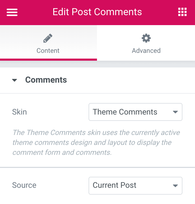
Content
Comments
- Skin: Select an available skin. Currently one skin is available, the Theme Comments skin. The Theme Comments skin uses the currently active theme comments design and layout to display the comment form and comments
- Source: Select the source of the user comments, either those from the Current Post or Custom. If Custom is chosen, the following option becomes available:
Search & Select: When you start typing a specific name of a post, you will get the autocomplete full name of the post, which you can then select. The comments from the selected post will be displayed.
Note: The Post Comments widget will only work if comments are allowed. This setting is controlled via WordPress Discussion settings.
Read the tutorial showing how to Create a Single Post Template
The Author Box widget is a Theme Element. It is one of the available Single Post Template widgets that is used to dynamically display the current post’s author box.
Content
- Drag an Author Box into the editing screen
Source: Choose between Current Author or Custom Author
Note: Current Author takes the WordPress user’s dynamic info to display the Post Author. Custom Author is static info.
- Profile Picture: Show or Hide the Profile Picture. When using Custom – upload an image
- Name: Show or Hide the Author Name. When using Custom – type the Author Name
- HTML Tag: Choose an HTML Tag for your Author
- Link To: Link the Author Name and Image to your website or your post archive. When using Custom – enter your own link
- Biography: Show or Hide your Author Biography. When using Custom – enter your Author Biography
- Archive Button: Show or Hide an Archive Button. This will direct your users to your post archive. When using Custom – enter your own link
- Archive Text: Type the Archive Button text
- Layout: Set the layout for your Author Box
- Alignment: Set the Alignment for your Author Box
Style
Image
- Vertical Align: align your Author image to the top or to the middle.
- Image Size: Set the image size
- Gap: Adjust the gap between the image and the text
- Border: Slide for a border
- Border Color: Set the border color
- Border Width: Set the border width
- Border Radius: Set the border radius
- Box Shadow: Add Box Shadow to your Image
Text
Under Name:
- Color: Set the Author name text color
- Typography: Set the typography design
- Gap: Set the gap between the Author Name and the Biography
Under Biography:
- Color: Set the Biography text color
- Typography: Set the typography design
- Gap: Set the gap between the Biography and the Button
Button
- Text Color: Set the Button Text Color
- Background Color: Set the button Background Color
- Typography: Set the Typography design
- Border Width: Set the border width
- Border Radius: Set the border radius
- Padding: Set the button padding
The Post Excerpt widget is a Theme Element. It is one of the available Single Post Template widgets that is used to dynamically display the current post’s excerpt.
Content

Post Excerpt is the only option.
Note: If you click “Post Excerpt”, a window will popup to allow you to choose a Fallback Excerpt in the event that a Post Excerpt does not exist. This popup also allows you to place static content Before and/or After the Post Excerpt
Style
- Text Color: Choose the color of the excerpt text
- Typography: Set the typography options for the excerpt text
Read the tutorial showing how to Create a Single Post Template
The Post Navigation widget is a Theme Element. It is one of the available Single Post Template widgets that is used to dynamically display navigation links to other posts.

Content
Post Navigation
- Label: Show or Hide the Previous/Next labels
- Previous Label: Enter the text for the Previous label
- Next Label: Enter the text for the Next label
- Arrows: Show or Hide the navigation arrows
- Arrows Type: Select a Font Awesome icon to represent the navigation arrows
- Post Title: Show or Hide the title of the previous or next post
- Borders: Show or Hide widget borders
- In Same Term: Indicates whether next post must be within the same taxonomy term as the current post, this lets you set a taxonomy per each post type
Style
Label
- Color: Choose the color of the labels
- Typography: Set the typography options for the labels
Title
- Color: Choose the color of the labels
- Typography: Set the typography options for the labels
Arrow
- Color: Choose the color of the arrows
- Size: Set the size of the arrows
- Gap: Set the amount of spacing between the arrows and the text
Borders
- Color: Choose the color of the borders
- Size: Set the size of the borders
- Spacing: Set the amount of spacing between the borders and the text
Read the tutorial showing how to Create a Single Post Template
The Post Info widget is a Theme Element. It is one of the available Single Post Template widgets that is used to dynamically display the current post’s meta data, such as author, date, time, and comments.

Content
Meta Data
Layout: Choose to display the post info items vertically or horizontally.
The next options are displayed as a list of all the available meta data. You can drag and drop them to change their order. Click on the Add Item button to add a custom post info meta item to the list.
Tip: Quickly duplicate or delete items by clicking an item’s Duplicate or Delete  icon.
icon.
By clicking on each item you can customize its content and settings, which are:
Author
- Type: Change the type of item from Author to Date, Time, Comments, Terms, or Custom
- Before: Enter text to be displayed before the Author
- Avatar: Set to YES to display the Author’s avatar next to the Author’s name
- Link: Set to YES to link to the Author’s archive
- Icon: Select None or select Default to display the default icon, or choose Custom to select a Font Awesome icon
Date
- Type: Change the type of item from Date to Author, Time, Comments, Terms, or Custom
- Date Format: Select from several date formats, or choose Custom to format your own
- Before: Enter text to be displayed before the Date
- Link: Set to YES to link to that Date’s archive
- Icon: Select None or select Default to display the default icon, or choose Custom to select a Font Awesome icon
Time
- Type: Change the type of item from Time to Author, Date, Comments, Terms, or Custom
- Time Format: Select from several time formats, or choose Custom to format your own
- Before: Enter text to be displayed before the Time
- Icon: Select None or select Default to display the default icon, or choose Custom to select a Font Awesome icon
Comments
- Type: Change the type of item from Comments to Author, Date, Time, Terms, or Custom
- Before: Enter text to be displayed before the Comments
- Custom Format: Set to YES to change the phrasing for No Comments, One Comment, etc.
- Link: Set to YES to link to the comment form for the current post
- Icon: Select None or select Default to display the default icon, or choose Custom to select a Font Awesome icon
Style
List
- Space Between: Adjust the space between each post info item
- Alignment: Align the list of post info items left, center, or right
- Divider: Set ON to add a divider line between each post info item.
If Divider is set to ON, the following options become available:
Divider
- Style: Select solid, double, dotted or dashed
- Weight: Set the divider’s weight
- Height: Set the divider’s height
- Color: Choose the divider’s color
Icon
- Color: Choose the color of the post info icon
- Size: Set the size of the post info icon
Text
- Text Indent: Set the amount of space the text is indented from the icon
- Text Color: Choose the color of the text
- Typography: Set the typography options for the text
Read the tutorial showing how to Create a Single Post Template
The Post Title widget is a Theme Element. It is one of the available Single Post Template widgets that is used to dynamically display the current post’s title.

Content
Title
- Title: Post Title is the only option
- Link: Enter a URL, or more appropriately, select the Dynamic icon to choose a dynamic URL such as the Post URL
- Size: Select the title size, choosing from Default, S, M, L, XL, or XXL. Additional sizing is available on the Style tab in the Typography options
- HTML Tag: Set the heading’s HTML tag to H1- H6, Div, Span or Paragraph
- Alignment: Align the post title to the left, right, center, or justified
 to choose a dynamic URL such as the Post URL
Note: If you click “Post Title”, a window will popup to allow you to choose a Fallback Title in the event that a Post Title does not exist. This popup also allows you to place static content Before and/or After the Post Title
Style
Title
- Text Color: Choose the color of the Title’s text
- Typography: Set the typography options for the Title
- Text Shadow: Add a shadow and blur to the Post Title
- Blend Mode: Set a blend mode for the title
Read the tutorial showing how to Create a Single Post Template