Control the colors and layout for WooCommerce Breadcrumbs
Style
Text Color: Choose the color of the Breadcrumbs text
Link Color: Choose the color of the Breadcrumbs link text
Typography: Set the typography options for the Breadcrumbs text
Alignment: Align the breadcrumbs to the left, right, or center
Note: The style of this widget is often affected by your theme and plugins. If you experience any such issue, try to switch to a basic theme and deactivate related plugins, or adjust the styling within your theme’s settings.
Control the product Data Tabs style in the WooCommerce Single template
Style
Tabs
Normal | Active
The following options can be set independently for both the normal and active states.
- Text Color: Choose the color of the Tabs text
- Background Color: Choose the background color of the Tabs text
- Border Color: Choose the border color of the Tab
- Typography: Set the typography options for the Tabs text
- Border Radius: Set the border radius to control corner roundness
Panel
- Text Color: Choose the color of the Panel text
- Typography: Set the typography options for the Panel text
Heading
- Text Color: Choose the color of the Heading text
- Typography: Set the typography options for the Heading text
- Border Width: Control the thickness of the Panel border
- Border Radius: Set the border radius to control corner roundness of the panel
- Box Shadow: Adjust box shadow options
Note: The style of this widget is often affected by your theme and plugins. If you experience any such issue, try to switch to a basic theme and deactivate related plugins, or adjust the styling within your theme’s settings.
Display a WooCommerce Page (Cart Page, Single Product Page, Checkout Page, Order Tracking Form, or My Account Page) anywhere on your site.
Content
Element
Page: Select a WooCommerce page to display, choosing from Cart Page, Single Product Page, Checkout Page, Order Tracking Form, or My Account Page. If “Single Product Page” is selected, an additional field becomes available to allow you to search and select a particular page to display.
Add Additional Information to your product display on WooCommerce Single template
Style
General
- Heading: Show or Hide
- Color: Choose the color of the Heading
- Typography: Change the typography options for the Heading
- Color: Choose the color of the Additional Information text
- Typography: Change the typography options for the Additional Information text
Display products on any page of your site, setting their content and style with the WooCommerce Products widget
Content
Products
- Columns: Set the exact number of columns to display, from 1 to 12
- Rows: Set the maximum number of rows to display
- Pagination: Select Yes to show Pagination or No to hide it
- Allow Order: Select Yes to give users the option to sort the products by Default, Popularity, Rating, Latest, Price: Low to High, or Price: High to Low
- Show Result Count: Select Yes to show number of results for this archive, or No to hide it
Query
Source: Select source of results, choosing from Current Query, Latest Products, Sale, Featured, or Manual Selection. Depending upon which source you’ve chosen for the query, you’ll be given options which allow you to filter the results.
Include
- Include By: Term, then use Search and Select to choose which ones to use
- Order By: Set the order in which the products will be displayed. Options include: Title, Price, Popularity, Rating, Random, and Menu Order.
- Order: DESC (descending) or ASC (ascending)
Note: Choosing Related as the Source and Category as the Include By term will display posts related to the category assigned to the current post being displayed. So if the user is viewing a post in the Travel category, for example, the page will show Related posts which are also in the Travel category. If the post currently displayed has multiple categories assigned to it, the Related posts will pull posts from the FIRST category (alphabetically) assigned to the post.
Exclude
- Exclude By: Current Post, Manual Selection, Term, then use Search and Select for Manual, or Term choices
- Order By: Set the order in which the posts will be displayed. Options include: Title, Price, Popularity, Rating, Random, and Menu Order.
- Order: DESC (descending) or ASC (ascending)
Style
Products
- Columns Gap: Set the exact gap between the columns
- Rows Gap: Set the exact gap between the rows
- Alignment: Align the products data to the left, right, or center
Image
- Border Type: Select the type of border, choosing from none, solid, double, dotted, dashed, or grooved
- Border Radius: Set the radius to control corner roundness of the border
- Spacing: Adjust the amount of space between the images and their data
Title
- Color: Choose the product Title color
- Typography: Set the typography options for the Title text
- Spacing: Adjust the amount of space after the Title
Rating
- Star Color: Choose the color of a filled star
- Empty Star Color: Choose the color of an empty star
- Star Size: Set the size of stars
- Spacing: Adjust the amount of space after the Rating Stars
Price
- Color: Choose the color of the product Price
- Typography: Set the typography options for the product Price
Regular price
- Color: Choose the color of the product’s Regular Price
- Typography: Set the typography options for the product’s Regular Price
Button
Normal | Hover
The following options can be set independently for both the normal and hover states.
- Text Color: Choose the color of the product’s Button Text
- Background Color: Choose the background color of the product’s Button
- Border Color: Choose the border color of the product’s Button
- Typography: Set the typography options for the product’s Button Text
- Border Type: Select the type of border, choosing from none, solid, double, dotted, dashed, or grooved
- Border Radius: Control corner roundness of the button’s border
- Text Padding: Set the padding within the button
- Spacing: Adjust the amount of space above the buttons
View Cart
- Color: Choose the color of the View Cart text under the buttons
- Typography: Set the typography options for the View Cart text
Box
- Border Width: Control the thickness of the border around the product’s box
- Border Radius: Control corner roundness of the products box
- Padding: Change the padding within the products box
Normal | Hover
The following options can be set independently for both the normal and hover states.
- Box Shadow: Adjust box shadow options
- Background Color: Choose the background color of the products box
- Border Color: Choose the border color of the products box
Sale Flash
- Sale Flash: Show or Hide
- Text Color: Choose the color of the Sale Flash text
- Background Color: Choose the background color of the Sale Flash
- Typography: Set the typography options for the Sale Flash text
- Border Radius: Control the corner roundness of the Sale Flash
- Width: Control the thickness of the border for the Sale Flash
- Height: Set the height of the Sale Flash
- Position: Set the position of the Sale Flash, Left or Right, of the products box
- Distance: Set the distance of the Sale Flash from the top of the products box
Note: The style of this widget is often affected by your theme and plugins. If you experience any such issue, try to switch to a basic theme and deactivate related plugins, or adjust the styling within your theme’s settings.
Set the image or gallery you wish to display for WooCommerce Products in the WooCommerce Single template
Style
- Sale Flash: Show or Hide the Sale Flash
- Border Type: Select the type of border, choosing from none, solid, double, dotted, dashed, or grooved
- Width: Control the thickness of the border around the main image
- Color: Choose a color for the border
- Border Radius: Set the border radius to control corner roundness
- Spacing: Adjust the amount of space between the main image and thumbnails
Thumbnails
- Border Type: Select the type of border, choosing from none, solid, double, dotted, dashed, or grooved
- Width: Control the thickness of the border around the thumbnails
- Color: Choose a color for the border
- Border Radius: Set the border radius to control corner roundness
- Spacing: Adjust the amount of space between each thumbnail
Note: The style of this widget is often affected by your theme and plugins. If you experience any such issue, try to switch to a basic theme and deactivate related plugins, or adjust the styling within your theme’s settings.
Display a grid of WooCommerce Product Categories anywhere on your site.
Content
Layout
- Columns: Set the exact number of columns to display, from 1 to 12
- Categories Count: Select the number of categories to display
Query
- Source: Select the source from which to display categories, choosing from All, Manual Selection, By Parent, or Current Subcategories. If Manual Selection is chosen, manually select which categories to display. If “By Parent” is chosen, select from Only Top Level, or select an individual category from the dropdown list.
- Hide Empty: Set to Yes to categories with no products within them
- Order By: Set the order in which the categories will be displayed. Options include Name, Slug, Description, or Count
- Order: Select to display categories in ASC or DESC (Ascending or Descending) order
Style
- Columns Gap: Set the exact gap between the columns
- Rows Gap: Set the exact gap between the rows
- Alignment: Align the products data to the left, right, or center
Image
- Border Type: Select the type of border, choosing from none, solid, double, dotted, dashed, or grooved
- Border Radius: Set the radius to control corner roundness of the border
- Spacing: Adjust the amount of space between the images and their data
Title
- Color: Choose the Title color
- Typography: Set the typography options for the Title text
Count
- Color: Choose the color for the Count
- Typography: Set typography options for the Count
Note: The style of this widget is often affected by your theme and plugins. If you experience any such issue, try to switch to a basic theme and deactivate related plugins, or adjust the styling within your theme’s settings.
Set the style and position of the Product Price in the WooCommerce Single template
Style
- Alignment: Align the Price to the left, right, or center
- Color: Choose the color of the Price’s text
- Typography: Change the typography options for the Price
Sale Price
- Color: Choose the color of the Sales Price text
- Typography: Change the typography options for the Sales Price
- Stacked: Select Yes to place the Sales Price under the Price or No to place the Sales Price next to the Price
- Spacing: Adjust the amount of space between the Price and the Sales Price
Note: The style of this widget is often affected by your theme and plugins. If you experience any such issue, try to switch to a basic theme and deactivate related plugins, or adjust the styling within your theme’s settings.
Add an Add to Cart button to a specific product anywhere on your site.
Content
Product
- Product: Select the product to be added to the cart
- Show Quantity: Set to Yes to allow the user to change the quantity
- Quantity: If Show Quantity is set to No, this option becomes available so that you can predetermine the number of items to add to the cart
Button
- Type: Select the type of button to use, choosing from Default, Info, Success, Warning, and Danger
- Text: Enter the text to be displayed on the button
- Alignment: Align the [widget] to the left, right, center, or justified
- Size: Select the preset button sizes, from Extra Small to Extra Large
- Icon: Select a Font Awesome icon to display on the button
- Icon Position: Choose to display the Icon Before or After the button text
- Icon Spacing: Set the amount of space between the Icon and the button text
- Button ID: (Optional) Assign a unique button ID to use for situations such as Google Analytic’s events
Style
Button
- Typography: Set the typography options for the button text
Normal | Hover
The following options can be set independently for both the normal and hover states.
- Text Color: Choose the color of the button text
- Background Color: Choose the background color of the button
- Hover Animation: Choose an animation effect when hovering over the icon, such as Grow, Pulse, Skew, etc.
- Border Type: Select the type of border, choosing from none, solid, double, dotted, dashed, or grooved
- Border Radius: Control border roundness of the button
- Box Shadow: Adjust box shadow options
- Padding: Set the padding within the button
Set the style and layout of the WooCommerce Archive Products
Content
Content
- Allow Order: Select Yes to give users the option to sort the products by Default, Popularity, Rating, Latest, Price: Low to High, or Price: High to Low
- Show Result Count: Select Yes to show number of results for this archive, or No to hide it
Advanced
- Nothing Found Message: Enter the message to be shown to users when there are no results to display
Style
Products
- Columns Gap: Set the exact gap between the columns
- Rows Gap: Set the exact gap between the rows
- Alignment: Align the products data to the left, right, or center
Image
- Border Type: Select the type of border, choosing from none, solid, double, dotted, dashed, or grooved
- Border Radius: Set the radius to control corner roundness of the border
- Spacing: Adjust the amount of space between the images and their data
Title
- Color: Choose the product Title color
- Typography: Set the typography options for the Title text
- Spacing: Adjust the amount of space after the Title
Rating
- Star Color: Choose the color of a filled star
- Empty Star Color: Choose the color of an empty star
- Star Size: Set the size of stars
- Spacing: Adjust the amount of space after the Rating Stars
Price
- Color: Choose the color of the product Price
- Typography: Set the typography options for the product Price
Regular price
- Color: Choose the color of the product’s Regular Price
- Typography: Set the typography options for the product’s Regular Price
Button
Normal | Hover
The following options can be set independently for both the normal and hover states.
- Text Color: Choose the color of the product’s Button Text
- Background Color: Choose the background color of the product’s Button
- Border Color: Choose the border color of the product’s Button
- Typography: Set the typography options for the product’s Button Text
- Border Type: Select the type of border, choosing from none, solid, double, dotted, dashed, or grooved
- Width: Control the thickness of the border around the product’s Button
- Border Radius: Control corner roundness of the button’s border
- Text Padding: Set the padding within the button
- Spacing: Adjust the amount of space above the buttons
View Cart
- Color: Choose the color of the View Cart text under the buttons
- Typography: Set the typography options for the View Cart text
Box
- Border Width: Control the thickness of the border around the product’s box
- Border Radius: Control corner roundness of the products box
- Padding: Change the padding within the products box
Normal | Hover
The following options can be set independently for both the normal and hover states.
- Box Shadow: Adjust box shadow options
- Background Color: Choose the background color of the products box
- Border Color: Choose the border color of the products box
Pagination
- Spacing: Set the amount of space above the pagination
- Border: Show or Hide border around pagination
- Border Color: Choose the color of the pagination border
- Padding: Set the padding within the pagination
Normal | Hover | Active
The following options can be set independently for the normal, hover, and active states.
- Typography: Set the typography options for the pagination text
- Color: Choose the color of the pagination text
- Background Color: Choose the background color for the pagination
Sale Flash
- Sale Flash: Show or Hide
- Text Color: Choose the color of the Sale Flash text
- Background Color: Choose the background color of the Sale Flash
- Typography: Set the typography options for the Sale Flash text
- Border Radius: Control the corner roundness of the Sale Flash
- Width: Control the thickness of the border for the Sale Flash
- Height: Set the height of the Sale Flash
- Position: Set the position of the Sale Flash, Left or Right, of the products box
- Distance: Set the distance of the Sale Flash from the top of the products box
Nothing Found Message
- Color: Choose the color of the Nothing Found Message text
- Typography: Set the typography options for the message text
Note: The style of this widget is often affected by your theme and plugins. If you experience any such issue, try to switch to a basic theme and deactivate related plugins, or adjust the styling within your theme’s settings.
The Media Carousel widget allows you to create a slider of videos and images.
The widget includes 3 skins:
- Carousel is the standard rotating carousel skin that shows a customized number of image or video slides per view.
- Slideshow is a slider skin that displays one primary slide and small image thumbnails below.
- Coverflow is a slider skin that shows a central slide in the front and two side slides in the back.
Inside each slide, you can add the image or video, and have it link to its media file or an external link. The carousel can display a mixture of both images and videos at once.
If you have Lightbox enabled, this will also be available for this widget.
The Media Carousel widget also has options for optimal display on mobile devices.
Carousel Skin
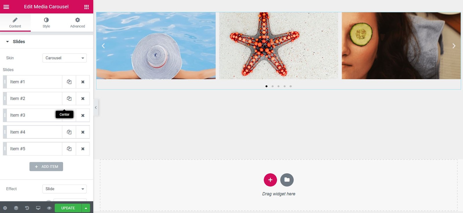
Content
Slides
- Skin: Carousel
- Slides: Choose the image or video to display and set the URL to link to
- Effect: Choose how each slide transitions, either Slide, Fade, or Cube
- Slides Per View: Set number of slides to view at one time, maximum of 10
- Slides to Scroll: Set number of slides to scroll per swipe, maximum of 10
- Height: Set the height of the carousel
- Width: Set the width of the carousel
Additional Options
- Arrows: Choose to show or hide the navigation arrows
- Pagination: Select None, Dots, Fraction, or Progress
- Transition Duration: Set the time it takes for each slide to appear. This time is in milliseconds, so 1000 ms is equal to 1 second.
- Autoplay: Show or hide
- Autoplay Speed: Set the time between each slide. This time is in milliseconds, so 1000 ms is equal to 1 second.
- Infinite Loop: Show carousel in continuous loop, infinitely. Yes or No
- Pause on Interaction: Select whether or not to pause autoplay when a user interacts with the carousel. Yes or No
- Overlay: Select overlay type, when user hovers over a slide. None, Text, or Icon
- Image Size: Select size of image, from Thumbnail to Full, or Custom
- Image Fit: Select how image fits into its container, either Cover, Contain, or Auto
Slideshow Skin
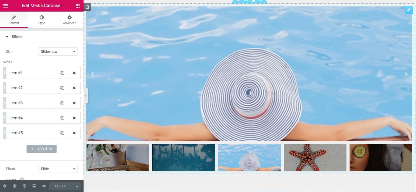
Content
- Skin: Slideshow
- Slides: Choose the image or video to display and set the URL to link to
- Effect: Choose how each slide transitions, either Slide, Fade, or Cube
- Height: Set the height of the carousel
- Thumbnails:
Slides Per View: Number of slides, per view, maximum of 10
Ratio: Select from 1:1, 4:3, 16:9, or 21:9
Additional Options
- Arrows: Choose to show or hide the navigation arrows
- Transition Duration: Set the time it takes for each slide to appear. This time is in milliseconds, so 1000 ms is equal to 1 second
- Autoplay: Show or hide
- Autoplay Speed: Set the time between each slide. This time is in milliseconds, so 1000 ms is equal to 1 second
- Infinite Loop: Show carousel in continuous loop, infinitely. Yes or No
- Pause on Interaction: Select whether or not to pause autoplay when a user interacts with the carousel. Yes or No
- Image Size: Select size of image, from Thumbnail to Full, or Custom
- Image Fit: Select how image fits into its container, either Cover, Contain, or Auto
Coverflow Skin

Content
- Skin: Coverflow
- Slides: Choose the image or video to display and set the URL to link to
- Slides Per View: Set number of slides to view at one time, maximum of 10
- Slides to Scroll: Set number of slides to scroll per swipe, maximum of 10
- Height: Set the height of the carousel
- Width: Set the width of the carousel
Additional Options
- Arrows: Choose to show or hide the navigation arrows
- Pagination: Select None, Dots, Fraction, or Progress
- Transition Duration: Set the time it takes for each slide to appear. This time is in milliseconds, so 1000 ms is equal to 1 second.
- Autoplay: Show or hide
- Autoplay Speed: Set the time between each slide. This time is in milliseconds, so 1000 ms is equal to 1 second.
- Infinite Loop: Show carousel in continuous loop, infinitely. Yes or No
- Pause on Interaction: Select whether or not to pause autoplay when a user interacts with the carousel. Yes or No
- Overlay: None, Text, or Icon
- If Text is chosen:
Caption: Choose which text to display as the caption – Title, Caption, or Description
Animation: Choose from Fade, Slide Up, Slide Down, Slide Right, Slide Left, Zoom In - If Icon is chosen:
Icon: Choose from a search icon, plus icon, eye icon, or link icon - Animation: Choose from Fade, Slide Up, Slide Down, Slide Right, Slide Left, Zoom In
- Image Size: Select size of image, from Thumbnail to Full, or Custom
- Image Fit: Select how image fits into its container, either Cover, Contain, or Auto
Style
Slides
- Space Between: Set the space between slides
- Background Color: Choose a background color for the carousel
- Border Size: Control the thickness of the border
- Border Color: Choose a color for the border
- Padding: Set the padding
- Border Radius: Set the border radius to control corner roundness
Navigation
Arrows
- Size: Scale arrow size up or down
- Color: Choose the color for the arrows
Pagination (not available on Slideshow type)
- Position: Place pagination outside or inside of slides
- Size: Scale pagination size up or down
- Color: Set the color of the pagination
Play Icon (You must have videos in the slides to see it)
- Color: Set the color of the video play icon
- Size: Set the size of the video play icon
- Text Shadow: Set the text shadow of the video play icon
Overlay (not available on Slideshow type)
If Text was chosen for the Overlay:
- Background Color: Choose a background color for the overlay
- Text Color: Choose the color of the overlay text
- Typography: Change the typography options for the overlay text
If Icon was chosen for Overlay:
- Background Color: Choose a background color for the overlay
- Text Color: Choose the color of the overlay icon
- Icon Size: Scale the size of the overlay icon up or down
Lightbox
- Color: Choose the lightbox background color
- UI Color: Choose the UI Color. This affects the lightbox arrow and dot navigations and the X closing icon.
- UI Hover Color: Choose the UI hover color. This affects the lightbox arrow and dot navigations and the X closing icon when the user hovers over each.
- Video Width: Set the width of the video
Note: Autoplay is affected by Google’s Autoplay policy on Chrome browsers.
Note: Using Elementor template shortcodes within the widget may sometimes work, but it is not a supported feature.
Advanced
Set the Advanced options that are applicable to this widget
The Menu Cart widget enables you to place a WooCommerce cart icon in your menu or anywhere on your page.

Content
Menu Icon
- Icon: Select the icon to show, choosing from Cart, Basket, or Bag, in Light, Medium or Solid designs.
- Items Indicator: Select the type of indicator to use for number of items in the cart, choosing from None, Bubble, or Plain
- Hide Empty: Slide to YES to hide items indicator if cart is empty
- Subtotal: Show or Hide the cart’s current subtotal
- Alignment: Align the menu cart to the left, right, or center
Style
Menu Icon
Normal | Hover
- Text Color: Choose the color of the subtotal text
- Icon Color: Choose the color of the cart icon
- Background Color: Choose the background color of the widget container
- Border Color: Choose the border color of the widget container
- Border Width: Control the thickness of the border around the widget container
- Border Radius: Set the border radius to control corner roundness
- Typography: Change the typography options for the subtotal text
Icon
- Size: Adjust the size of the cart icon
- Spacing: Adjust the amount of space between the cart icon and the subtotal text
- Padding: Change the padding settings of the widget container
Items Indicator
- Text Color: Choose the color of the number of items in the items indicator
- Background Color: Choose the background color of items indicator
- Distance: Set the distance between the icons indicator and the subtotal text
Note: When the Menu Cart is clicked, a cart overlay slides open. The following options control the design aspects of the cart overlay.

Cart
- Divider: Show or Hide the divider line after each item in the cart overlay
- Remove Item Icon: Show or Hide the icon that allows users to remove an item from the cart
Subtotal
- Color: Choose the color of the subtotal text in the cart overlay
- Typography: Change the typography options for the subtotal text in the cart overlay
Products
Product Title
- Color: Choose the color of the product title in the cart overlay
- Typography: Change the typography options for the product title in the cart overlay
Product Price
- Color: Choose the color of the product price in the cart overlay
- Typography: Change the typography options for the product price in the cart overlay
Divider
- Style: Select the style of the divider above and below the subtotal in the cart overlay, choosing from none, solid, double, dotted, dashed, or grooved
- Color: Choose the color of the subtotal divider in the cart overlay
- Weight: Set the thickness of the subtotal divider
- Spacing: Set the spacing between subtotal dividers and the subtotal text
Buttons
- Layout: Choose the layout of the buttons in the cart overlay, either Inline or Stacked.
- Space Between: Set the amount of space between the cart overlay buttons
View Cart
- Text Color: Choose the color of the Show Cart button text in the cart overlay
- Background Color: Choose the background color of the Show Cart button in the cart overlay
- Border Color: Choose the border color of the Show Cart button in the cart overlay
- Border Width: Control the thickness of the border around the Show Cart button in the cart overlay
Checkout
- Text Color: Choose the color of the Checkout button text in the cart overlay
- Background Color: Choose the background color of the Checkout button in the cart overlay
- Border Color: Choose the border color of the Checkout button in the cart overlay
- Border Width: Control the thickness of the border around the Checkout button text in the cart overlay
- Typography: Change the typography options for both buttons in the cart overlay
- Border Radius: Set the border radius for both buttons in the cart overlay
Mini Cart
To avoid conflicts with WooCommerce plugins or themes that may utilize their own Mini Cart templates, Elementor gives you the option to enable or disable Elementor’s version of the Mini Cart template. If WooCommerce is activated, follow these steps to enable or disable Elementor’s Mini Cart template.
- Go to Elementor > Settings > Integrations > WooCommerce
- Choose Enable for this option in order to replace the default WooCommerce mini cart template or your theme’s mini cart template with Elementor’s template. Unless manually set to Disable, this setting is automatically enabled once the Menu Cart widget is used anywhere on your site.
- Choose Disable to opt out of using Elementor’s Mini Cart template.

Display and control the style of the product Meta Data on WooCommerce Single template
Style
Style
- View: Choose to display the Product Meta in Table view, Stacked view, or Inline
- Space Between: Set the amount of space between each Product Meta item
- Divider: Set to On to place a divider line between each Product Meta item
- Style: Choose the style of the divider line from Solid, Double, Dotted, or Dashed.
- Weight: Control the thickness of the divider line
- Height: Control the height of the divider line
- Color: Choose the color of the divider line
Text
- Typography: Set the typography options for the Product Meta text
- Color: Choose the color of the Product Meta text
Link
- Typography: Set the typography options for the Product Meta link text
- Color: Choose the color of the Product Meta link text
Captions
Category
- Singular: Set the name to use for Singular Category
- Plural: Set the name to use for Plural Category
Tag
- Singular: Set the name to use for Singular Tag
- Plural: Set the name to use for Singular Tag
SKU
- SKU: Set the name to use for Defined SKU
- Missing: Set the name to use for Missing SKU
Note: The style of this widget is often affected by your theme and plugins. If you experience any such issue, try to switch to a basic theme and deactivate related plugins, or adjust the styling within your theme’s settings.
Control the style and layout of your WooCommerce Archive Title
Content
- Title: Automatically dynamically generated
- Link: Enter the URL for the item’s link. Click the Link Options cog
 to either add rel=nofollow to the link or to open the link in a new window.
 - Size: Choose from Default, Small, Medium, Large, XL, XXL
- HTML Tag: Select the HTML tag to use for the Title, from H1 to H6, or div, span, or p
- Alignment: Align the Title to the left, right, center, or justified
 to either add rel=nofollow to the link or to open the link in a new window.
Style
- Text Color: Choose the color of the text
- Typography: Change the typography options for the text
- Text Shadow: Add a shadow and blur to the text
- Blend Mode: Select from multiple layer effects including Normal, Multiply, Screen, Overlay, etc.
Tip: Want to hide the Category name? Click the title to open the Settings options. Slide Include Context to No.

Style the Product Content on the WooCommerce Single template
Style
- Alignment: Align the product content to the left, right, center, or justified
- Text Color: Choose the color of the product content of the text
- Typography: Set the typography options for the product content text
Insert an “Add To Cart” button and control the layout and style of the Add to Cart button in the WooCommerce Single template
Style
Button
- Alignment: Align the title to the left, right, center, or justified
- Typography: Change the typography options for the Add To Cart button
- Border Type: Select the type of border, choosing from none, solid, double, dotted, dashed, or grooved
- Border Radius: Set the border radius to control corner roundness
- Padding: Change the padding settings of the button
Normal | Hover
The following options can be set independently for both the normal and hover states.
- Text Color: Choose the color of the button’s text
- Background Color: Choose the background color of the button
- Border Color: Choose the border color of the button
Quantity
- Spacing: Adjust the amount of space between the Quantity field and the Button
- Typography: Change the typography options for the Quantity text
- Border Type: Select the type of border, choosing from none, solid, double, dotted, dashed, or grooved
- Border Radius: Set the border radius to control corner roundness
- Padding: Change the padding settings of the Quantity field
Normal | Focus
The following options can be set independently for both the normal and focus states.
- Text Color: Choose the color of the Quantity’s text
- Background Color: Choose the background color of the Quantity field
- Border Color: Choose the border color of the Quantity field
Variations
- Spacing: Change the amount of space between the variations and the Add To Cart button
- Space Between: Change the amount of space between each variation
Label
- Color: Choose the color of the Variations’ Label text
- Typography: Change the typography options of the Variations’ Label text
Select Field
- Color: Choose the color of the Variations’ Select field text
- Background Color: Choose the background color of the Variations’ Select field
- Border Color: Choose the border color of the Variations’ Select field
- Typography: Change the typography options of the Variations’ Select field
- Border Radius: Set the border radius to control corner roundness
Note: The style of this widget is often affected by your theme and plugins. If you experience any such issue, try to switch to a basic theme and deactivate related plugins, or adjust the styling within your theme’s settings.
The Reviews widget displays a sliding carousel of user reviews.
Content
Slides
Items
Shows a list of all the items in the slide. You can drag and drop them to change their order. Click on the Add Item button to add another item to the list.
Tip: Quickly duplicate or delete items by clicking an item’s Duplicate or Delete icon 
- Image: Upload or choose the reviewer’s image
- Name: Enter the reviewer’s name
- Title: Enter the reviewer’s job title
- Rating: Assign a numerical rating, from 0.0 to 5.0
- Icon: Choose the type of icon to use, either Font Awesome or Unicode
- Link: Link the review to a URL
- Review: Enter the text of the review
- Slides Per View: Select the number of slides to show at one time, from 1 to 10
- Slides to Scroll: Select how many slides to scroll per swipe, from 1 to 10
- Width: Set the width of the carousel, in percentage or pixels
Additional Options:
- Arrows: Show or hide the navigation arrows
- Pagination: Select the carousel pagination style, either None, Dots, Fraction, or Progress
- Transition Duration: Set the time between slide movement, in milliseconds
- Autoplay: Slide to YES to have the carousel slide automatically
- Autoplay Speed: Set the speed at which the carousel will slide, in milliseconds
- Infinite Loop: Set to YES to have the carousel continue sliding, infinitely
- Pause on Interaction: Set to YES to have the autoplay pause when the carousel is hovered over with a mouse or clicked
- Image Size: Set the size of the image, from thumbnail to full, or enter a custom size
Style
Slides
- Space Between: Control the space between review items
- Background Color: Choose the background color of the review card
- Border Size: Set the thickness of the border around the review card
- Border Radius: Set the border radius to control corner roundness
- Border Color: Choose a color for the border
- Padding: Set the padding within the border of the review card’s box
Header
- Background Color: Choose the background color of the review card’s header
- Gap: Control the space between the Header and the Review text
- Separator: Choose to show or hide the separator line between the header and the review text
- Color: Choose the color of the separator line
- Size: Set the height of the separator line
Text
Name / Title / Review
- Color: Choose the color of the Name/Title/Review
- Typography: Change the typography options for the Name/Title/Review
Image
- Image Size: Adjust the size of the reviewer’s image
- Image Gap: Control the space between the image and the reviewer’s profile information
- Border Radius: Set the border radius to control corner roundness
Icon
- Color: Set the color of the social icon. Choose either the Official Color of the social network, or set a custom color of your choice
- Size: Adjust the size of the social icon
Rating
- Icon: Choose the type of icon to use, either Font Awesome or Unicode
- Unmarked Style: Choose Solid or Outline for unmarked icons
- Size: Set the size of the rating stars
- Spacing: Adjust the amount of space between each star
- Color: Choose the color of the rating stars
- Unmarked Color: Choose the color of the unmarked portion of the stars
Navigation
Arrows / Pagination
- Size: Adjust the size of the navigation arrows
- Color: Choose the color of the navigation arrows

Note: Autoplay is affected by Google’s Autoplay policy on Chrome browsers.
Control the colors and layout for WooCommerce Breadcrumbs
Style
Text Color: Choose the color of the Breadcrumbs text
Link Color: Choose the color of the Breadcrumbs link text
Typography: Set the typography options for the Breadcrumbs text
Alignment: Align the breadcrumbs to the left, right, or center
Note: The style of this widget is often affected by your theme and plugins. If you experience any such issue, try to switch to a basic theme and deactivate related plugins, or adjust the styling within your theme’s settings.
Control the style and layout of the Product Title in the WooCommerce Single template
Content
- Title: Automatically dynamically generated
- Link: Enter the URL for the item’s link. Click the Link Options cog to either add rel=nofollow to the link or to open the link in a new window.
- Size: Choose from Default, Small, Medium, Large, XL, XXL
- HTML Tag: Select the HTML tag to use for the Title, from H1 to H6, or div, span, or p
- Alignment: Align the Title to the left, right, center, or justified
 to either add rel=nofollow to the link or to open the link in a new window.
Style
- Text Color: Choose the color of the text
- Typography: Change the typography options for the text
- Text Shadow: Add a shadow and blur to the text
- Blend Mode: Select from multiple layer effects including Normal, Multiply, Screen, Overlay, etc.
Insert and set the style for Related Products in WooCommerce Single template
Content
Related Products
- Products Per Page: Set the exact amount of related products to be displayed
- Columns: Set how many columns will be displayed, from 1 to 12, for each device (Desktop, Tablet, Mobile)
- Order By: Set the order in which the products will be displayed. Options include Date, Title, Price, Popularity, Rating, Random, Menu Order
- Order: Select ASC or DESC (ascending or descending) order
Style
- Columns Gap: Set the exact gap between the columns
- Rows Gap: Set the exact gap between the rows
- Alignment: Align the related products data to the left, right, or center
Image
- Border Type: Select the type of border, choosing from none, solid, double, dotted, dashed, or grooved
- Width: Control the thickness of the border around the related product images
- Color: Choose the border color
- Border Radius: Set the radius to control corner roundness of the border
- Spacing: Adjust the amount of space between the images and their data
Title
- Color: Choose the related product Title color
- Typography: Set the typography options for the Title text
- Spacing: Adjust the amount of space after the Title
Rating
- Star Color: Choose the color of a filled star
- Empty Star Color: Choose the color of an empty star
- Star Size: Set the size of stars
- Spacing: Adjust the amount of space after the Rating Stars
Price
- Color: Choose the color of the related product Price
- Typography: Set the typography options for the related product Price
Regular price
- Color: Choose the color of the related product’s Regular Price
- Typography: Set the typography options for the related product’s Regular Price
Button
Normal | Hover
The following options can be set independently for both the normal and hover states.
- Text Color: Choose the color of the related product’s Button Text
- Background Color: Choose the background color of the related product’s Button
- Border Color: Choose the border color of the related product’s Button
- Typography: Set the typography options for the related product’s Button Text
- Border Type: Select the type of border, choosing from none, solid, double, dotted, dashed, or grooved
- Width: Control the thickness of the border around the related product’s Button
- Border Radius: Control corner roundness of the button’s border
- Text Padding: Set the padding within the button
- Spacing: Adjust the amount of space above the buttons
View Cart
- Color: Choose the color of the View Cart text under the buttons
- Typography: Set the typography options for the View Cart text
Heading
- Heading: Show or Hide the Related Products heading
- Color: Choose the color of the related products heading text
- Typography: Set the typography options for the heading text
- Text Align: Align the related products Heading to the left, right, or center
- Spacing: Adjust the amount of space after the Heading
Box
- Border Width: Control the thickness of the border around the related product’s box
- Border Radius: Control corner roundness of the related products box
- Padding: Change the padding within the related products box
Normal | Hover
The following options can be set independently for both the normal and hover states.
- Box Shadow: Adjust box shadow options
- Background Color: Choose the background color of the related products box
- Border Color: Choose the border color of the related products box
Sale Flash
- Sale Flash: Show or Hide
- Text Color: Choose the color of the Sale Flash text
- Background Color: Choose the background color of the Sale Flash
- Typography: Set the typography options for the Sale Flash text
- Border Radius: Control the corner roundness of the Sale Flash
- Width: Control the thickness of the border for the Sale Flash
- Height: Set the height of the Sale Flash
- Position: Set the position of the Sale Flash, Left or Right, of the related products box
- Distance: Set the distance of the Sale Flash from the top of the related products box
Note: The style of this widget is often affected by your theme and plugins. If you experience any such issue, try to switch to a basic theme and deactivate related plugins, or adjust the styling within your theme’s settings.
Control the layout and style of the product Short Description on WooCommerce Single template
Short Description
Style
- Alignment: Align the short description to the left, right, center, or justified
- Text Color: Choose the color of the Short Description text
- Typography: Set the typography options for the Short Description text
Note: The style of this widget is often affected by your theme and plugins. If you experience any such issue, try to switch to a basic theme and deactivate related plugins, or adjust the styling within your theme’s settings.
Display and style Product Stock info on WooCommerce Single template
Style
- Text Color: Choose the color of the Product Stock text
- Typography: Set the typography options for the Product Stock text
Note: The style of this widget is often affected by your theme and plugins. If you experience any such issue, try to switch to a basic theme and deactivate related plugins, or adjust the styling within your theme’s settings.
Set the style and placement of the Archive Description within the Product Archive template
- Alignment: Align the Archive Description widget to the left, right, center, or justified
- Text Color: Set the color of the text
- Typography: Set the typography option of the text

Set the Upsell Products style in WooCommerce Single template. Make sure to set the Product Upsells in your Product pages > Linked Products > Upsells. This is where the Upsells widget gets the information from.
Content
Upsells
- Columns: Set how many columns will be displayed, from 1 to 12, for each device (Desktop, Tablet, Mobile)
- Order By: Set the order in which the upsells will be displayed. Options include Date, Title, Price, Popularity, Rating, Random, Menu Order
- Order: Select ASC or DESC (ascending or descending) order
Style
Products
- Columns Gap: Set the exact gap between the upsell products columns
- Rows Gap: Set the exact gap between the upsell products rows
- Alignment: Align the upsells data to the left, right, or center
Image
- Border Type: Select the type of border, choosing from none, solid, double, dotted, dashed, or grooved
- Width: Control the thickness of the border around the upsell product images
- Color: Choose the border color
- Border Radius: Set the radius to control corner roundness of the border
- Spacing: Adjust the amount of space between the images and their data
Title
- Color: Choose the color of the upsell product title
- Typography: Set the typography options for the upsell product title
- Spacing: Adjust the amount of space after the upsell product title
Rating
- Star Color: Choose the color of a filled star
- Empty Star Color: Choose the color of an empty star
- Star Size: Set the size of stars
- Spacing: Adjust the amount of space after the Rating Stars
Price
- Color: Choose the color of the upsell product Price
- Typography: Set the typography options for the upsell product Price
Regular price
- Color: Choose the color of the upsell product’s Regular Price
- Typography: Set the typography options for the upsell product’s Regular Price
Button
Normal | Hover
The following options can be set independently for both the normal and hover states.
- Text Color: Choose the color of the upsell product’s Button Text
- Background Color: Choose the background color of the upsell product’s Button
- Border Color: Choose the border color of the upsell product’s Button
- Typography: Set the typography options for the upsell product’s Button Text
- Border Type: Select the type of border, choosing from none, solid, double, dotted, dashed, or grooved
- Width: Control the thickness of the border around the upsell product’s Button
- Border Radius: Control corner roundness of the button’s border
- Text Padding: Set the padding within the button
- Spacing: Adjust the amount of space above the buttons
View Cart
- Color: Choose the color of the View Cart text under the buttons
- Typography: Set the typography options for the View Cart text
Heading
Heading: Show or Hide the upsell products heading
Box
- Border Width: Control the thickness of the border around the upsell product’s box
- Border Radius: Control corner roundness of the upsell products box
- Padding: Change the padding within the upsell products box
Normal | Hover
The following options can be set independently for both the normal and hover states.
- Box Shadow: Adjust box shadow options
- Background Color: Choose the background color of the upsell products box
- Border Color: Choose the border color of the upsell products box
Sale Flash
- Sale Flash: Show or Hide
- Text Color: Choose the color of the Sale Flash text
- Background Color: Choose the background color of the Sale Flash
- Typography: Set the typography options for the Sale Flash text
- Border Radius: Control the corner roundness of the Sale Flash
- Width: Control the thickness of the border for the Sale Flash
- Height: Set the height of the Sale Flash
- Position: Set the position of the Sale Flash, Left or Right, of the upsell products box
- Distance: Set the distance of the Sale Flash from the top of the upsell products box
Note: The style of this widget is often affected by your theme and plugins. If you experience any such issue, try to switch to a basic theme and deactivate related plugins, or adjust the styling within your theme’s settings.
Set the style and position of the Product Rating within the Single Product template
Style
- Star Color: Choose the color of the filled stars
- Empty Star Color: Choose the color of the empty stars
- Link Color: Choose the color of the link to customer reviews
- Typography: Set the typography options for the customer reviews link
- Star Size: Set the exact size of the stars
- Space Between: Control the amount of space between the stars and the link
- Alignment: Align the Product Rating widget to the left, right, center, or justified
